Kinsa Insights
Real-time infectious illness insights and predictive analytics
This data product delivers localized insights to illness product brands so that they can plan for market demand, and to hospitals that need better ED admission prediction. I played a key role in defining the vision and steered efforts towards building a custom in-house solution.
The Problem
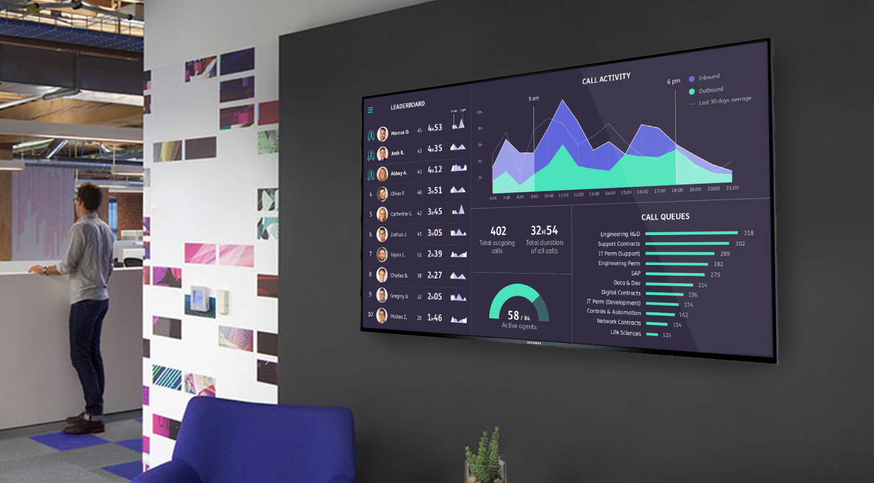
When I joined Kinsa, their analytics platform was relying on a third-party BI tool that failed to meet the business and user needs. It was slow, unstable, and didn't allow for much control over the UI. Additionally, we wanted to be able to automate beautiful charts for communication purposes. The process of collecting data from disconnected sources and manually visualizing data in silos was inefficient and wasted valuable employee time.
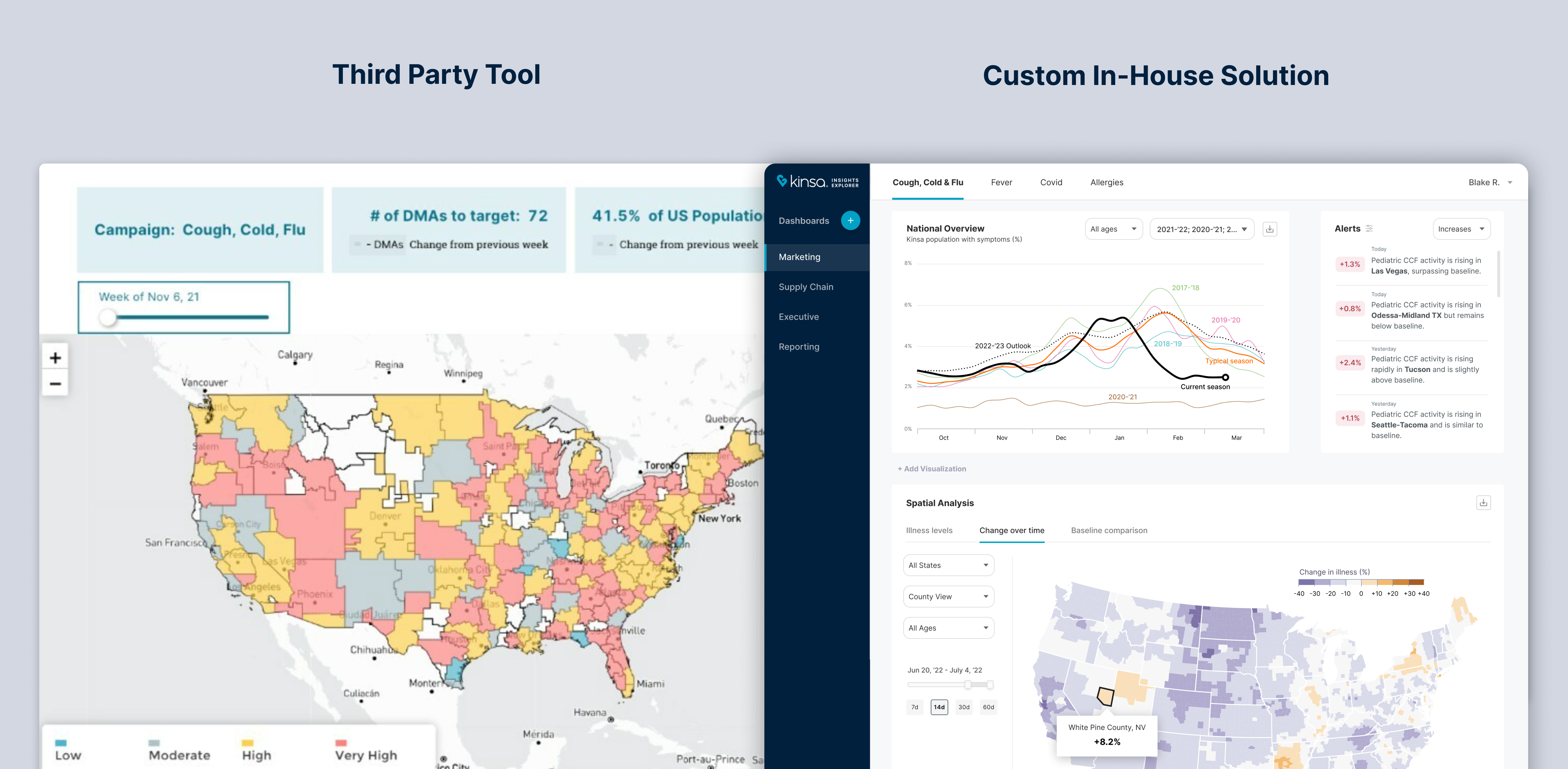
Justifying a Custom In-House Solution
At first, the idea of building a solution from scratch faced resistance from some stakeholders because we had limited resources. From my perspective, this approach was more strategic for several reasons:
-
A specialized visualization tool fitted the business better than a generic BI tool, enabling focused visualization and better data interpretation.
-
Full control over infrastructure and front-end development.
-
No annual contract and cost associated.
-
Scalable. Customization can be added as customer needs evolve.
-
No limit to customization with a visualization library such as d3.js.
-
Crafting an excellent product can increase employee productivity, motivation, and user satisfaction.
We assessed several proprietary and open-source visualization tools that could accelerate the deployment. After narrowing it down to just a few, we ultimately chose the custom in-house solution. This is where a well-established design vision played a crucial role in getting buy-in from all stakeholders.
Understanding the Data
Gaining a comprehensive understanding of the data's nature and potential was crucial to developing a simple in-house solution.
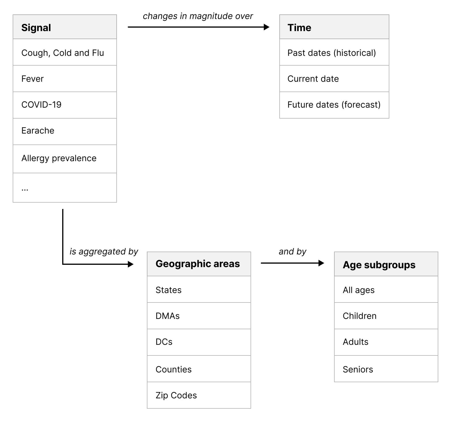
They collect geolocalized and time-stamped data from smart thermometers via a smartphone app, where users can report their symptoms and temperature. Once collected, their model generates incidence estimates that allow to gain a deeper understanding of infectious illness trends. The diagram below provides a clear illustration of the basic structure.
Laying it out this way enabled us to identify the most effective filters to be used in the UI to explore and visualize data from various angles. While the type of illness signals may evolve or be added over time, the principles remain constant. In short, illness levels fluctuate over time, and vary based on geography and age groups.
Defining the Most Important Insights
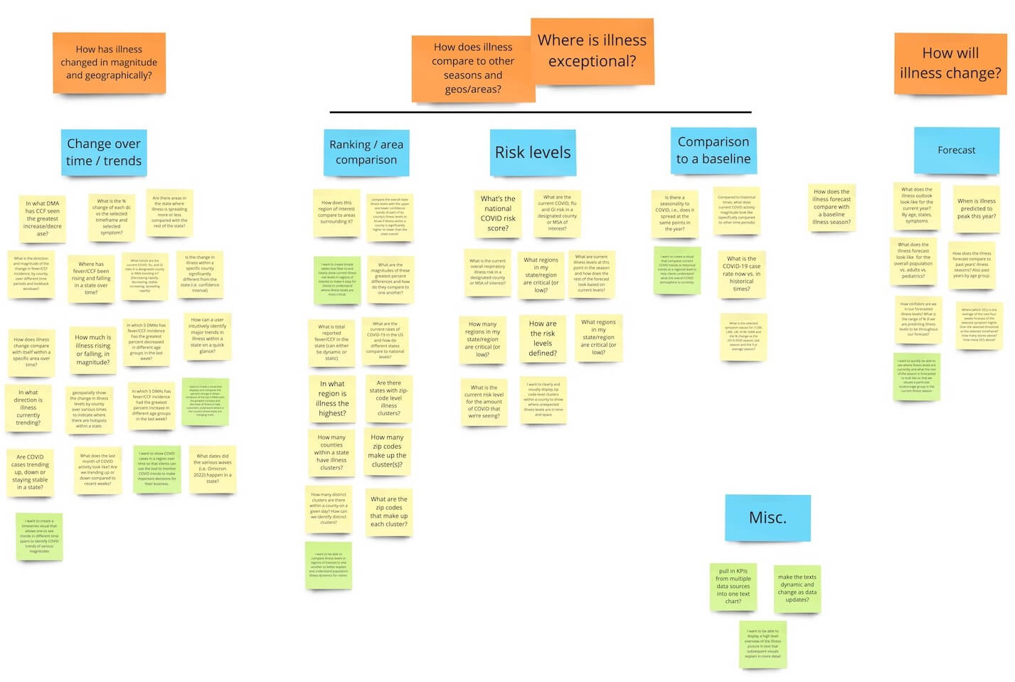
I participated in discovery research along with the PM and the other designer to find out what users wanted to achieve and what were there current pain points. What we learned was that while there were varying degrees of detail and time frames needed depending on the industry and role, the main questions that needed to be answered to take action were the same across the board. We boiled them down to 4:
-
How has illness changed in magnitude and geographically?
-
How does illness compare to other seasons and geographic areas?
-
Where is illness exceptional?
-
What do the coming weeks/months look like?
Prior to this, the visualizations created by our data analysts using a third-party tool were limited to subgroups of data and insights, with limited opportunities for exploration. Finding the common denominators helped us establish a simpler and more adaptable approach to creating the UI and visualizations.
Establishing the Visualization Framework
By moving away from third-party tools, we were able to hone in on a small set of visualizations that were uniquely tailored to our business needs. It implied developing a coherent architecture that could facilitate meaningful user-interactions and efficient data processing.
I was instrumental in developing a framework that achieved these goals, utilizing a UX design structure and patterns that prioritized flexibility, efficiency, robustness, customizability, and graphical consistency.
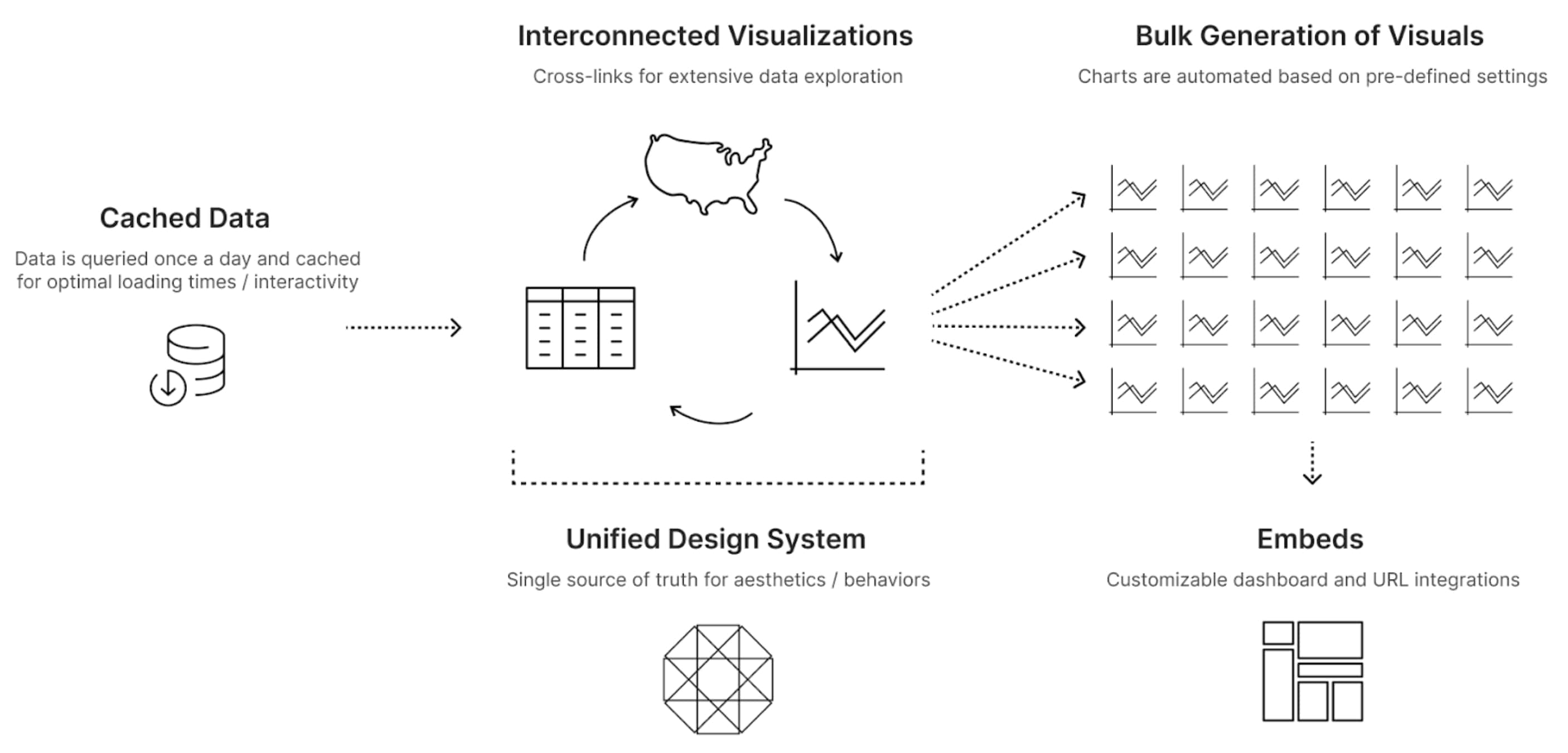
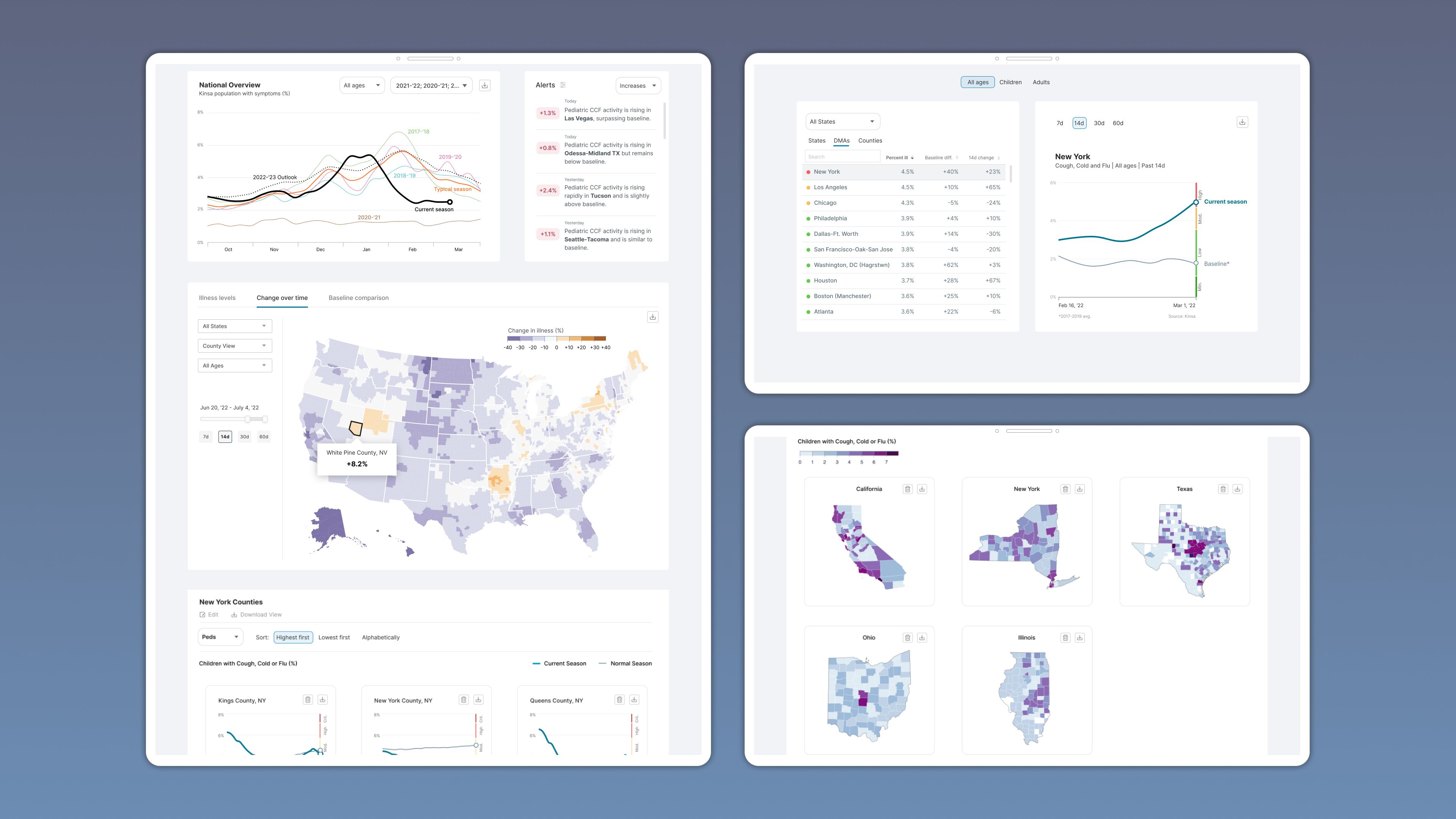
This approach involved creating highly customized, interactive visualizations that were following data visualization best practices. And rather than operating in isolation like the initial platform, the visualizations could be interconnected, enabling users to effortlessly navigate between different charts by simply clicking on a table row or map zone. Another benefit was the ability to bulk generate charts and maps within custom dashboards.
Defining the Visualizations
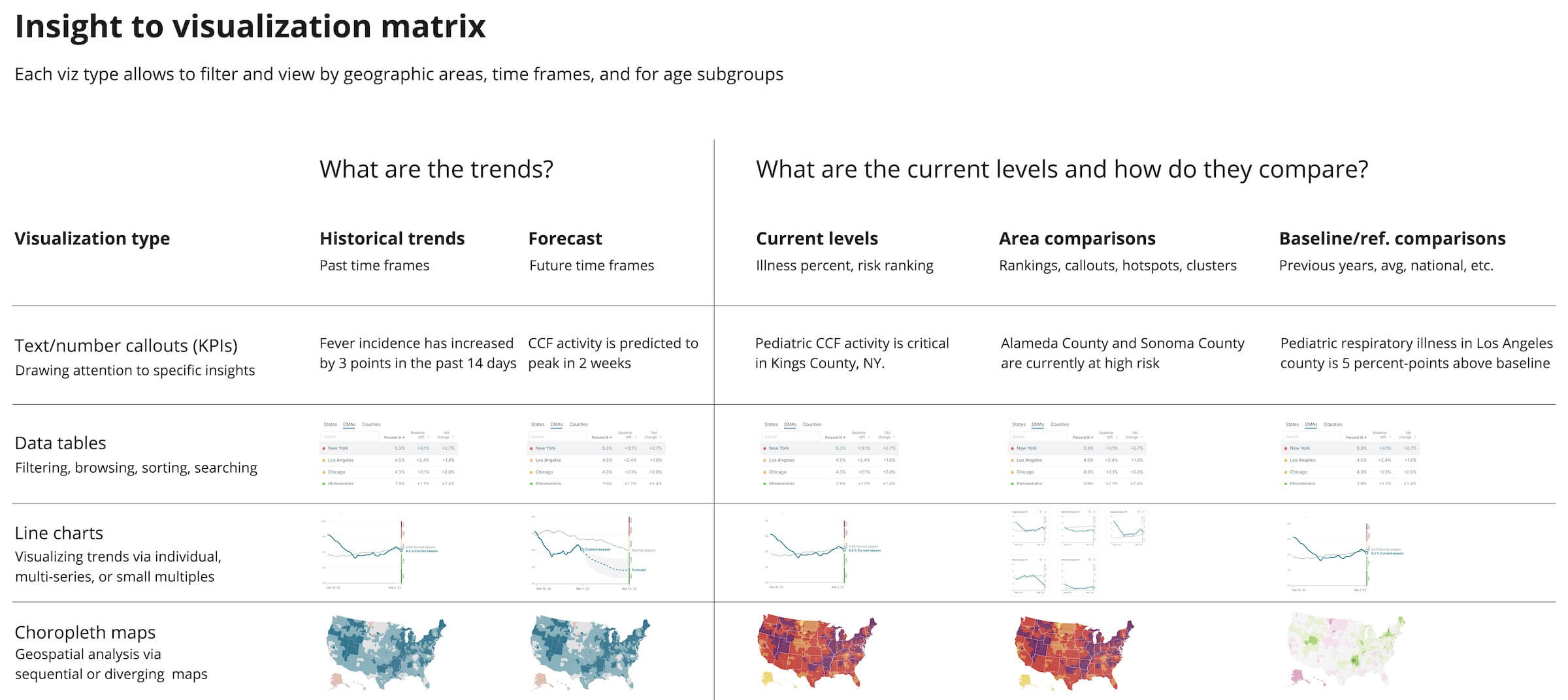
We determined that only four types of visualizations were necessary, based on the nature of the data and our top insights. These were line charts, tables, maps, and text/number callouts. Each type serves a unique purpose in analysis, and a variety of them are often needed to achieve a comprehensive and accurate understanding of the data. For instance, maps allow for spatial visualization, while tables offer precise numerical information and rankings. Line charts are useful for tracking trends over time, while KPIs provide a quick summary of high-level information. By combining these visualizations within a dashboard, users are empowered to explore the data from multiple angles and levels of detail.
Starting with a Proof-Of-Concept
One of the first steps we took in the development process was to create a simple data visualization component that could be connected to our API. This helped us evaluate feasibility and gather feedback from users, while minimizing the time and resources needed to build it.
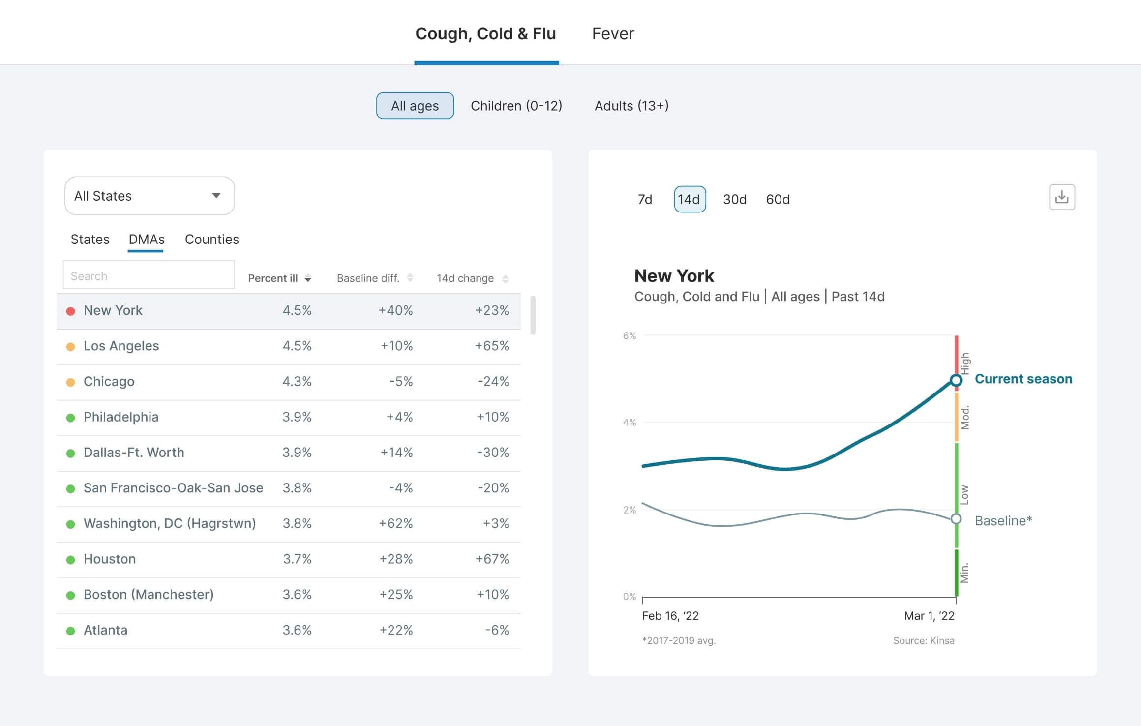
To kick-start the line-chart, I took the initiative to learn some basics of d3.js. With some existing code and modifications to suit our data, I was able to create a simple line-chart as a proof-of-concept. Working with a software engineer and a data engineer, we then integrated filters and a dynamic table that was linked to the line-chart (see below). After some small UX tweaks, this mini dashboard proved to be a highly efficient way of browsing, sorting, and filtering the data, while also providing a quick snapshot of regional trends.
Different Usages of Maps
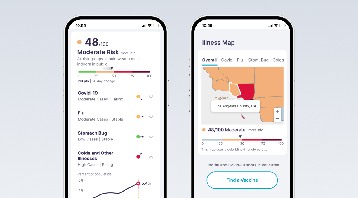
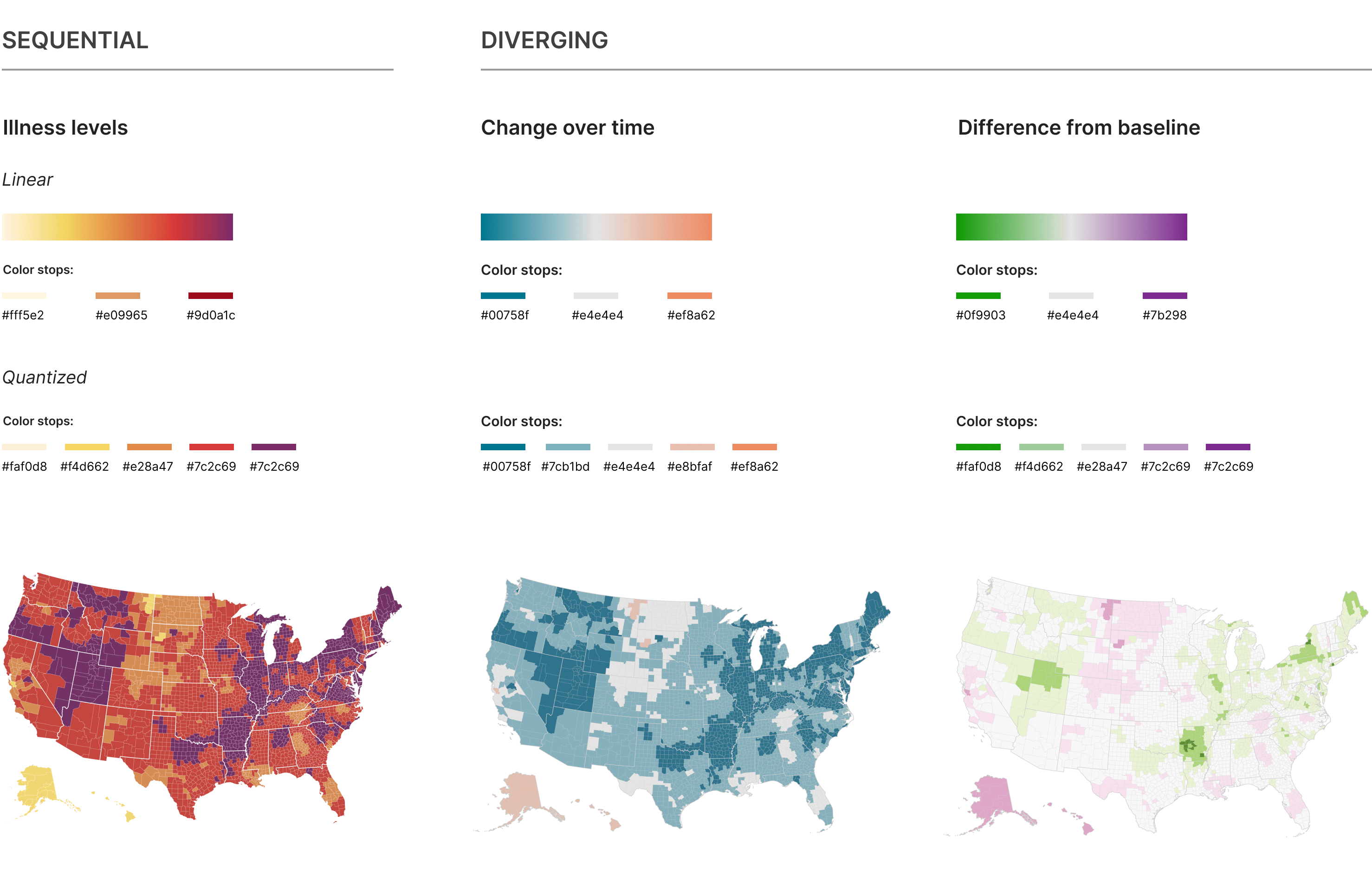
To optimize the user experience, I differentiated the map scale based on the type of insight. The color palettes were tailored for three types of data analysis: current illness levels, changes over time, and deviations from a baseline. This distinction enables users to quickly identify the type of insight they are viewing.
Towards Self-Service Analytics
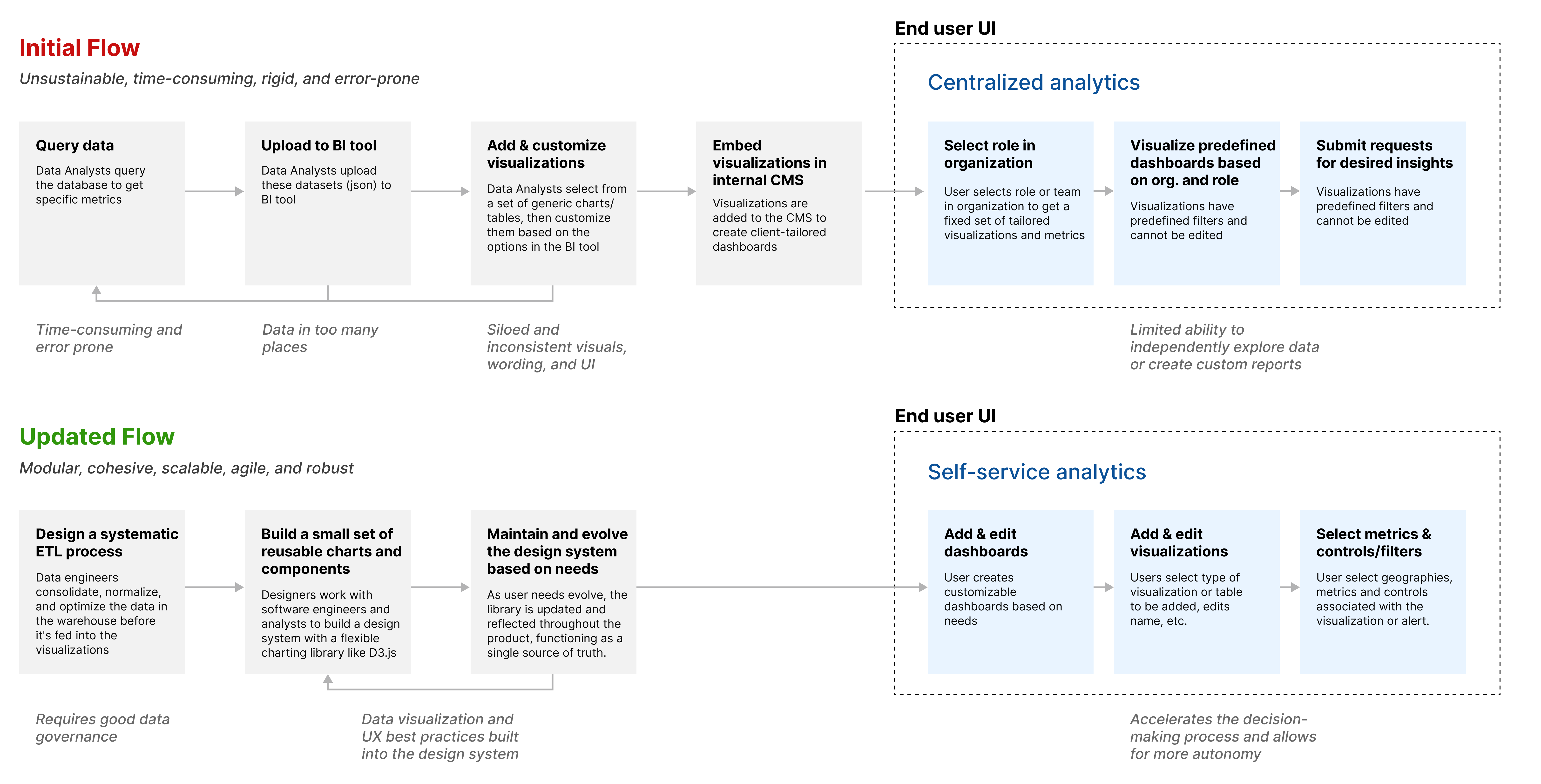
One of the main pain points with the initial platform was that users could not create their own views in the dashboards. Everything was generated by the data analysts, trying to best serve clients' needs. In order to offer users a more personalized experience, we implemented a feature that enabled them to select which data and visualization type they wanted to display. I was instrumental in transitioning towards a self-service analytics system by advocating for an updated workflow.
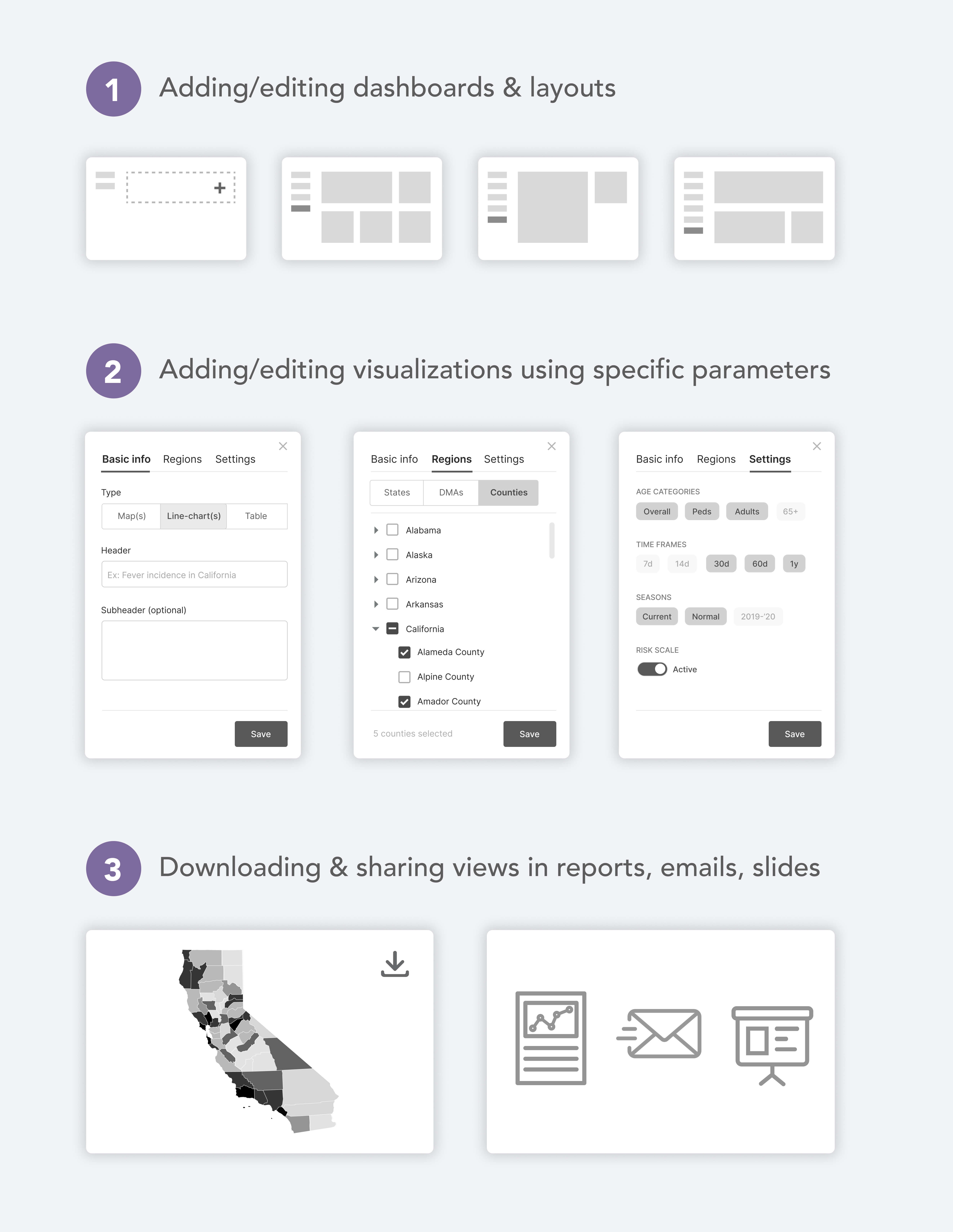
Leveraging the Power of Small Multiples
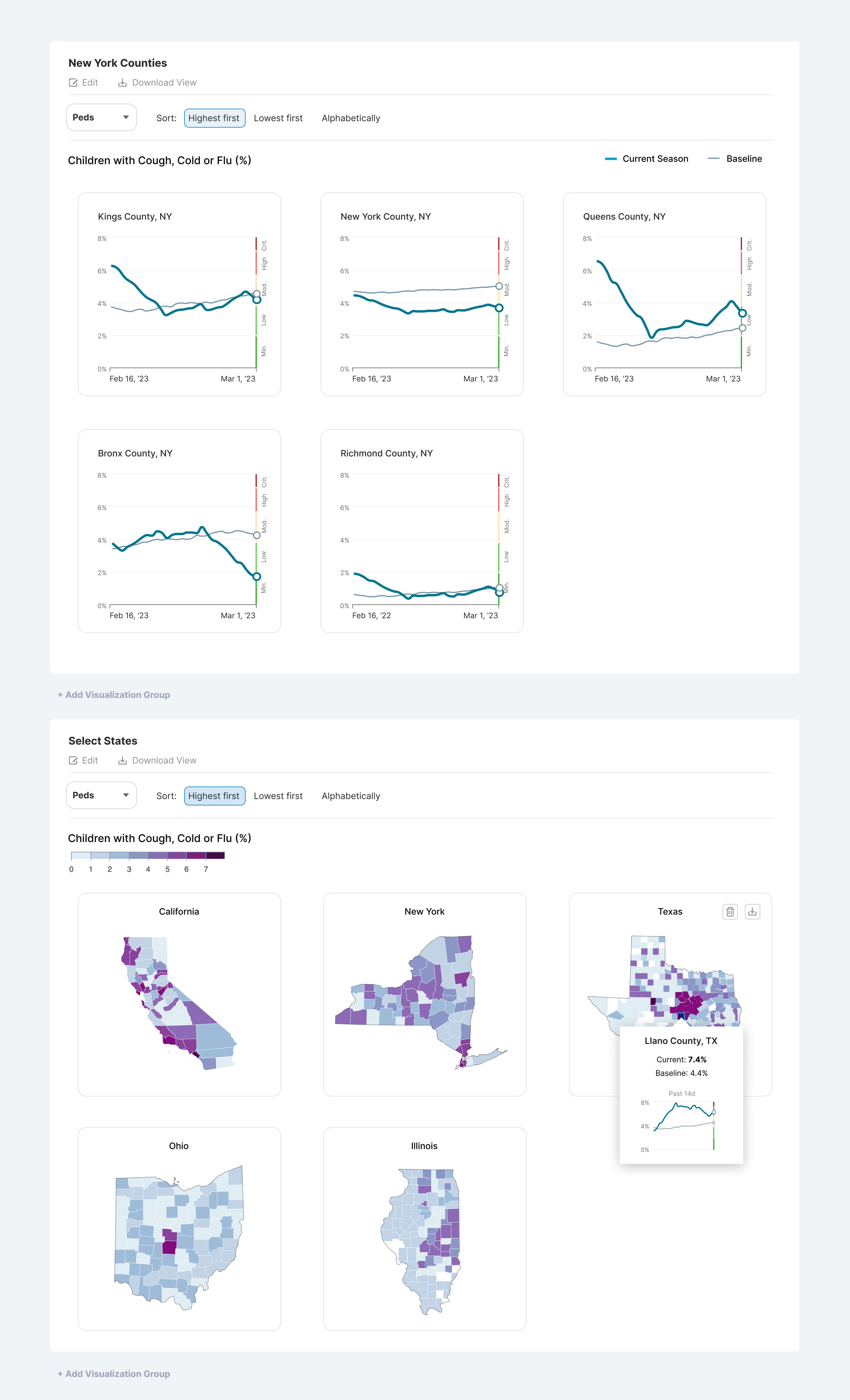
Because users needed to focus on certain select regions of interest rather than the entire U.S., we needed a way to display the data for them to make quick comparisons.
Small multiples were the solution we chose because they allow for easy comparison and understanding of patterns and trends across different subsets of data. They also simplify complex data into manageable subsets, making it easier for viewers to analyze and interpret the data.
Creating the Admin Panel
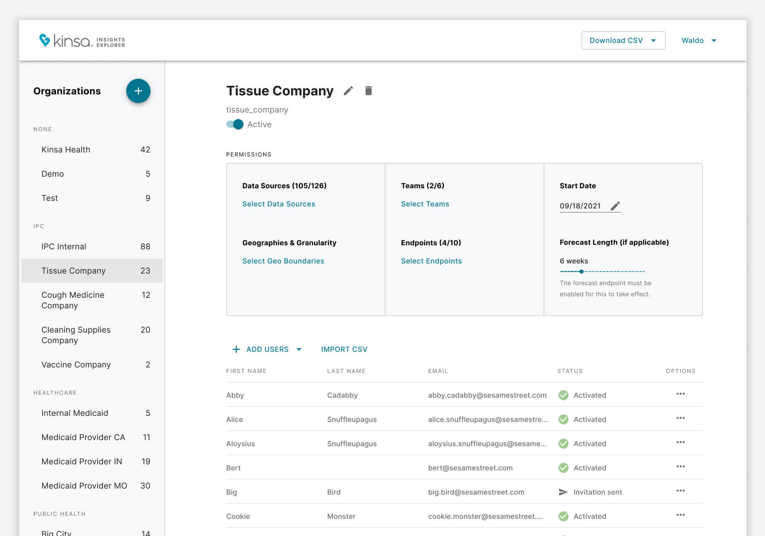
Internal admin users needed the ability to create companies, add users to them, and manage their data permissions (i.e. geographic areas, signals, age groups, etc.). To do so, we designed and developed an admin panel from scratch, using Material UI.
Impact
- Laid the groundwork for future development.
- Increased user retention in the first months by up to 5x with faster and more efficient ways of getting insights.
- Significantly reduced page load time.
- Reduced the need for manual chart creation by more than 50%.
Learnings
- Conducting a comprehensive exploration of different technologies and strategies is paramount to building consensus within a team and driving innovation.
- Gaining a deep understanding of how the data works helps define a clear UX strategy.
- Creating a proof of concept is a good way to get stakeholders on board.

