HealthWeather
Local illness tracker for Covid-19, flu, colds and stomach bug
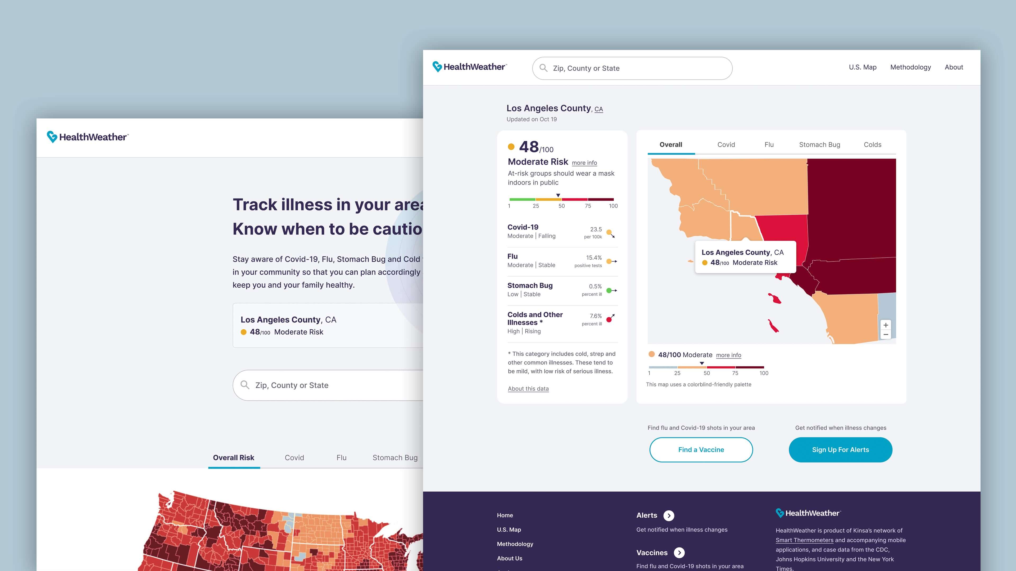
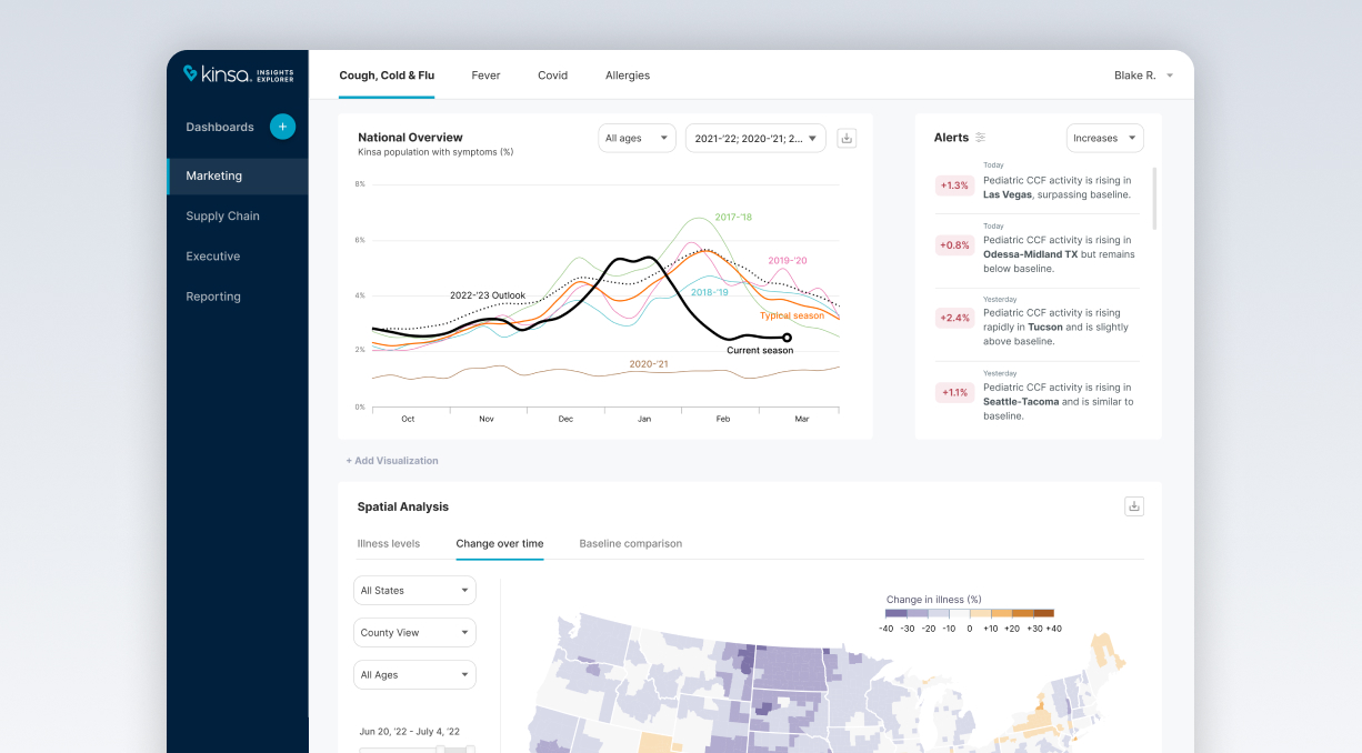
I led design on the revamp of this local illness tracker by redefining the guiding principles and conducting extensive user research. This mobile-first solution goes beyond Covid data with additional sources of real-time illness, including a proprietary network of millions of households.
The Problem
Kinsa, a healthcare tech startup, launched HealthWeather during the 2020 pandemic to provide real-time illness information to over two million users. As their data capabilities expanded post-pandemic, the website needed to reflect the changes to create an accurate picture of illnesses in every U.S. county.
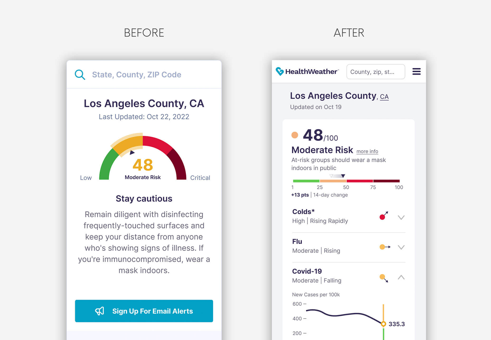
From a design perspective, the initial version of the website oversimplified information, providing only a single risk score number. To reach a more informed audience, the redesign included specific illness stats and trend-lines, becoming complete, data-centric, and trustworthy. As the lead designer, my role was to conduct user research and design cross-platform screens for the tracker, using a more developed visual language.
Discovery
The Product Manager conducted a two-day design sprint with the entire team to define the problem, then get as many creative solutions as possible in a short amount of time.
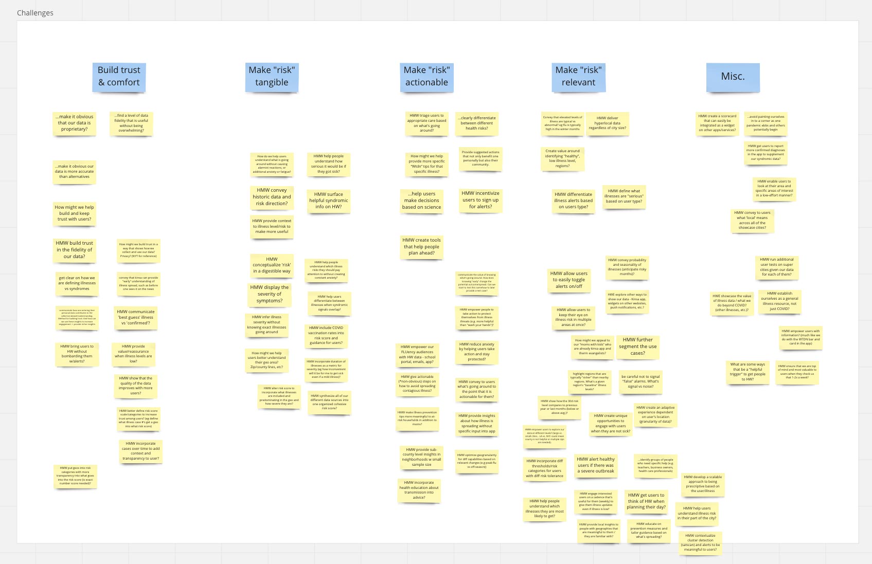
After a series of exchanges with key epidemiologists and data engineers, a competitive analysis, and a review of some findings from past user research, we did a How Might We (HMW) session to frame the design challenges. A few common threads emerged from the exercise.
The information in the tracker needed to be trustworthy, tangible, actionable, and relevant.
Quick Sketch Ideation
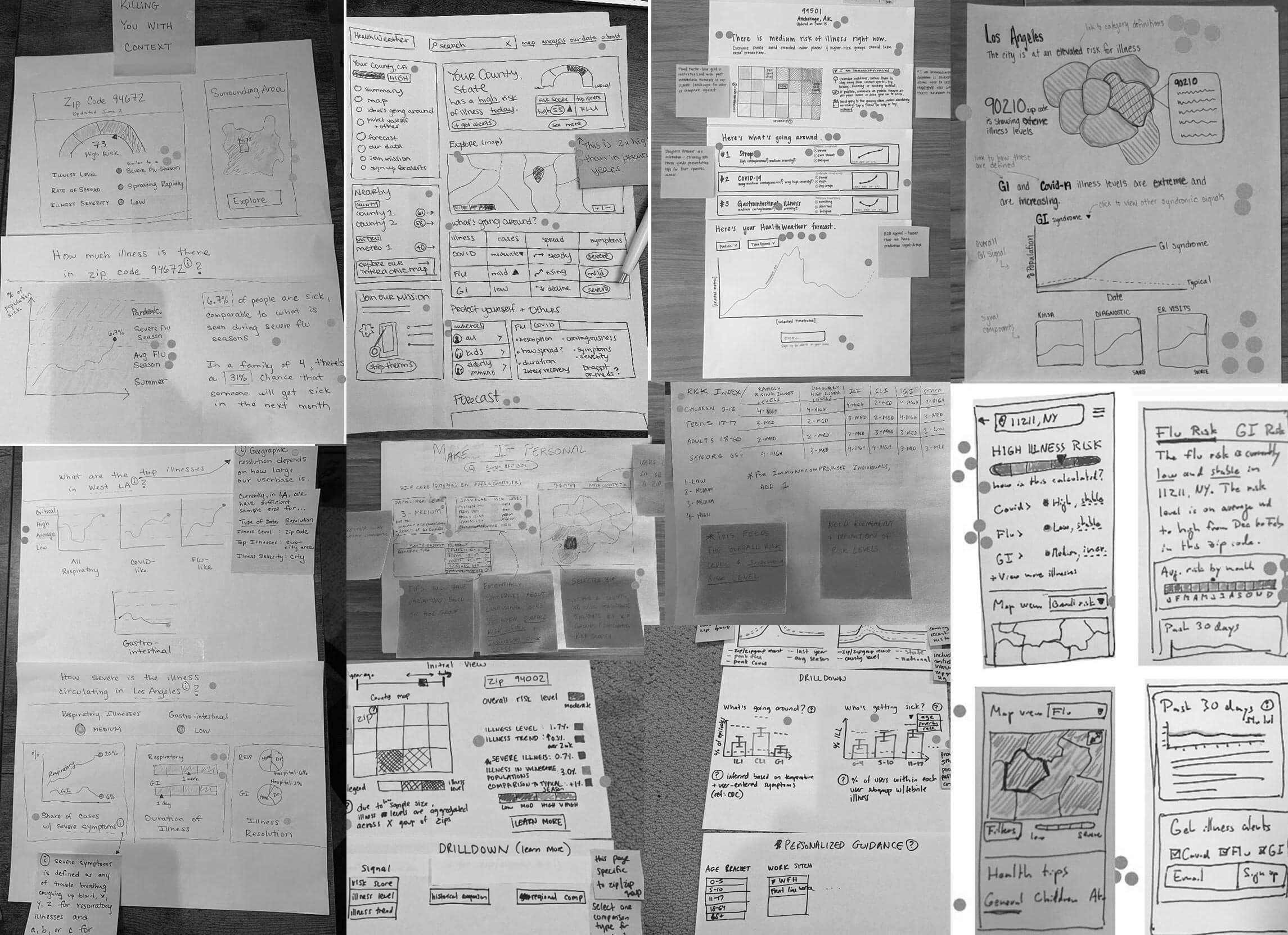
We then individually sketched a series of solutions that incorporated various elements of the problems we had framed and that were inspired by tools we had reviewed, notably CovidActNow, Breezometer, and AQI. Some of the recurring concepts like the time series and map options, influenced the prototypes I subsequently built for user testing.
Early Iterations
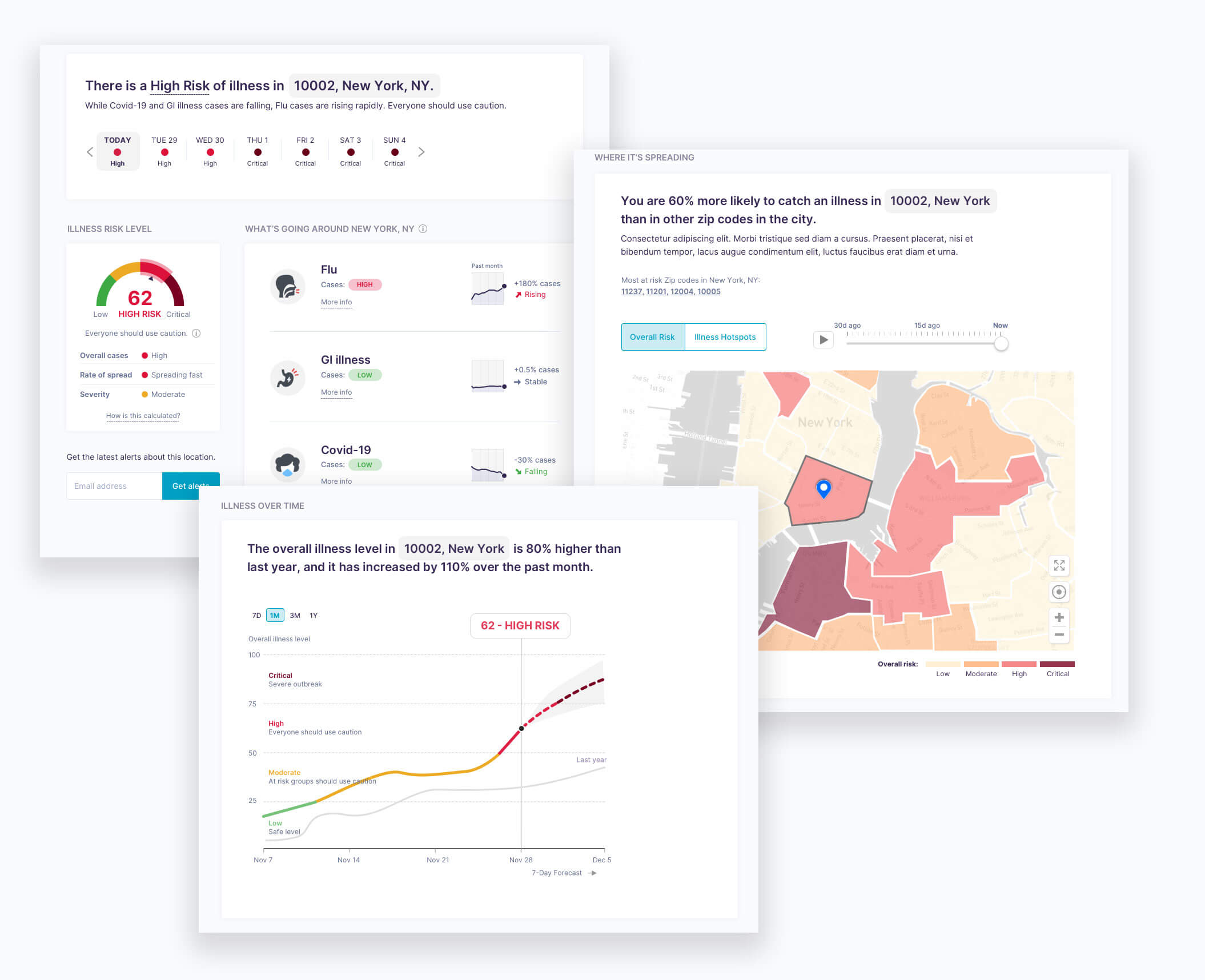
Shortly after the design sprint, I built an interactive desktop prototype that incorporated features we had agreed on: illnesses going around; a choropleth map; a historical and forecast time series; and tips based on user type.
The first unmoderated user test we ran was targeting specific user segments for which we believed we had product-market fit: people of 55+ at risk of getting seriously ill; people who live with someone at risk; and moms of young kids. There were a total of 15 participants for the first round, equally distributed among the different user types.
We formulated some high level questions that the user test was intended to answer, based on our design challenges:
-
How digestible and clear is the information?
-
Which components are the most and least valuable?
-
What level of granularity of information is preferred?
-
Does guidance on 'how to avoid' provide significant value if the tips are specific to the type of user (e.g. kids, immunocompromised)?
-
How trustworthy is the information?
-
How helpful is the tool overall?
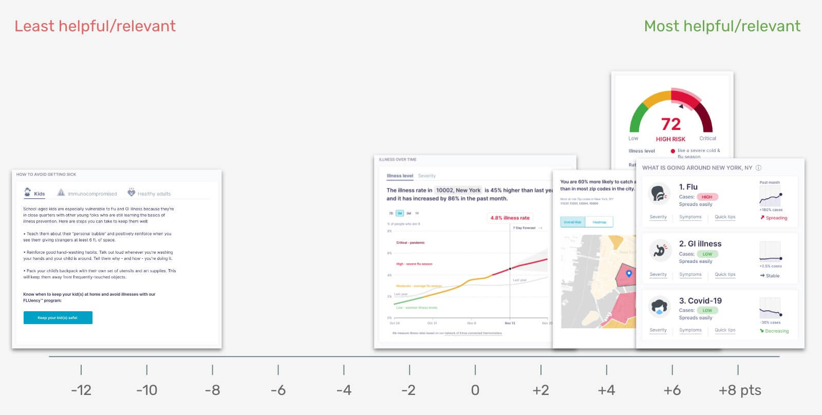
Overall, the prototype performed well and scored highly in terms of clarity and usefulness. One of the main takeaways was that the advice on 'how to avoid getting sick' was the least helpful part. Because people had been hearing over and over about social distancing, crowd avoidance, mask wearing, and disinfecting, the tips did not provide any significant value. What counted for them was to get information as local as possible to help guide their usual daily precautions depending on prevalent illnesses, and to know which areas to avoid. For moms, it also gave an understanding of what illness their child might have.
Unfortunately, despite including the zip level in the prototype, our data capabilities remained limited to a county level in most areas of the country, apart from New York City and Los Angeles. Also, we could not deliver a forecast other than nationally.
The flu, stomach bug, and colds metrics were an addition that showed meaningful value to those at risk that need to avoid getting sick overall, not just from Covid. That section performed the best.
Most importantly, a majority of users mentioned that they wanted to know the source of the data and how the risk score was calculated, which confirmed the need to gain trust in an era of information abundance.
Honing the Approach with Guiding Principles
The learnings from the first iterations allowed me to take a step back and reconsider the architecture and design of the tool, as well as the spectrum of information presented based on our data capabilities. Subsequently, I defined a new set of design principles that allowed the team to be aligned on a north star:
-
Mobile-first
Optimize the display of information for small screens. -
Data-first
Use more visuals and dynamic data than words. Aim for design and copy efficiency. -
Simplicity
Represent complexity with as few and as simple elements as possible. -
Detail & Depth
Allow users to drill down and access additional insights. Transparency
Offer specificity and clarity around numbers, data sources and methodology.
In other words, I wanted to optimize the usage of screen real estate so that the essential information could be seen at a glance. The idea was to make it look simple, yet complete and trustworthy. That meant doing as little design as possible. Consequently, it would also make it easier on the engineers.
Reframing the Design
With the newly defined approach it was important to boil down the design to the most fundamental parts. And so, it took a slightly different direction.
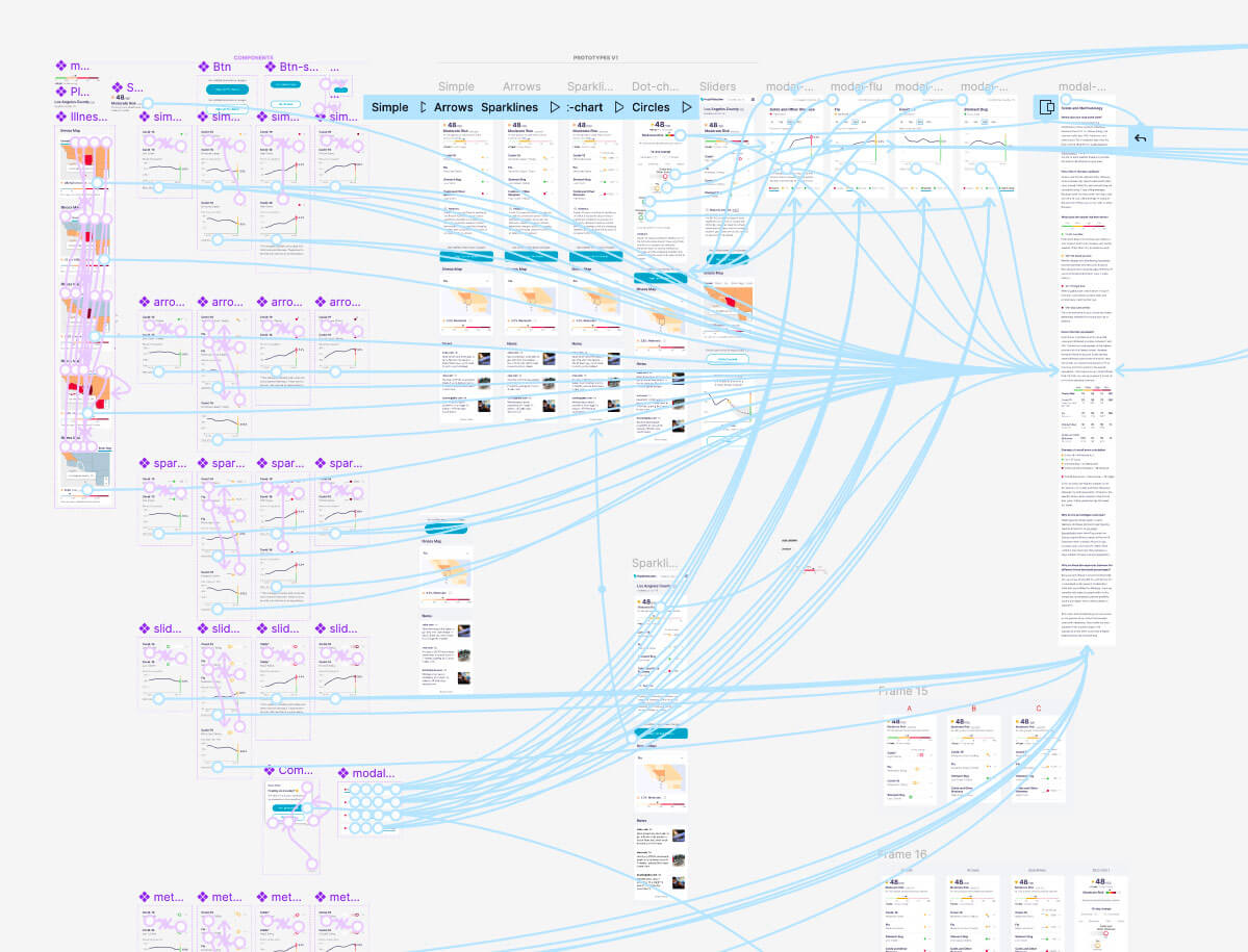
I created 4 variations of the same design and tested them with a total of 80 participants. I wanted to make sure with this series of tests that we would reach statistical significance and that it would yield quantitative results in addition to qualitative insights.
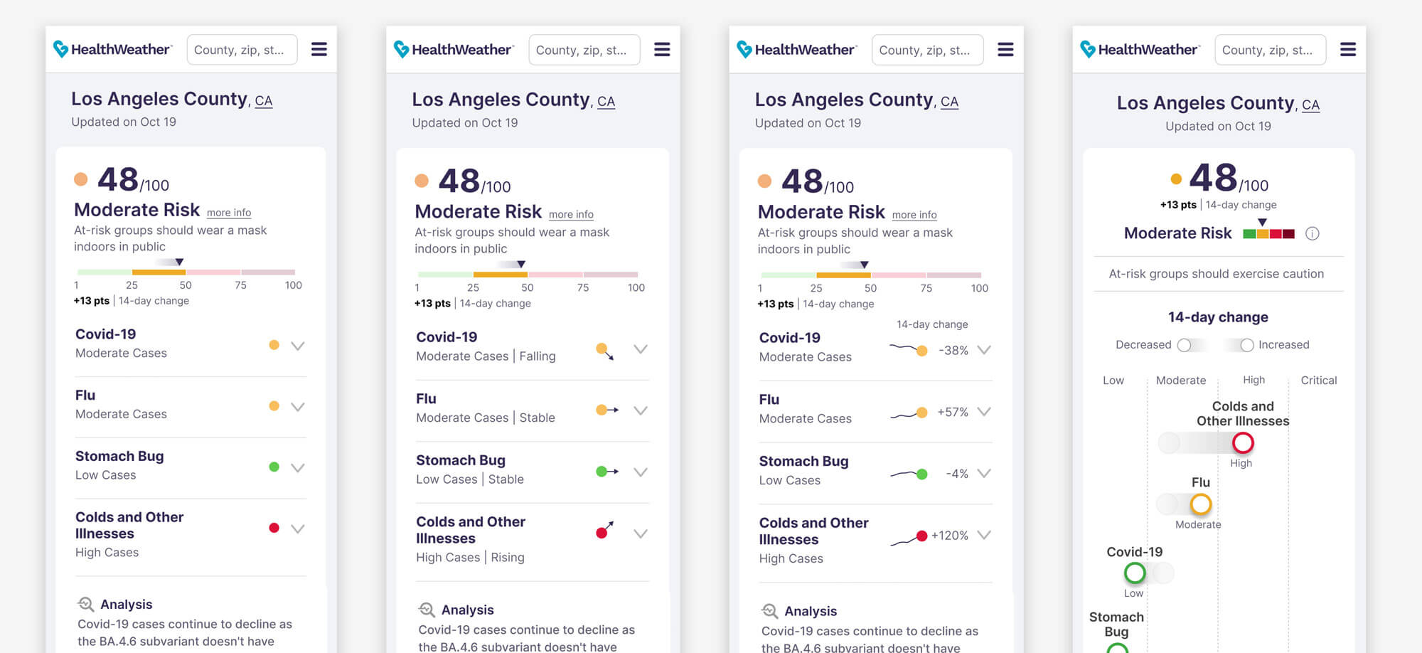
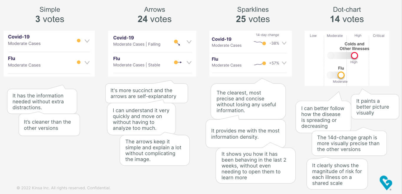
Because users rated the 'what's going around' section as the most relevant, it was important to nail it. The main difference between each version was the visual language used to display the data. They also slightly varied in information density — e.g. sparklines vs. directional arrows. The rest of the page was identical across all four prototypes. It included a drill-down into more historic data, an interactive map, and a news section that would connect to a news API to display regional articles related to illness, which we thought could be an interesting feature.
User Test Findings
The results were overall very positive. The clarity of information was rated 4.5/5, and the helpfulness of the tracker got a 4.2, all users combined. Users particularly enjoyed the way the information was concisely presented, as well as the ability to drill down into more info. On the other hand, some questioned accuracy and others simply wanted to know more about the methodology and sources.
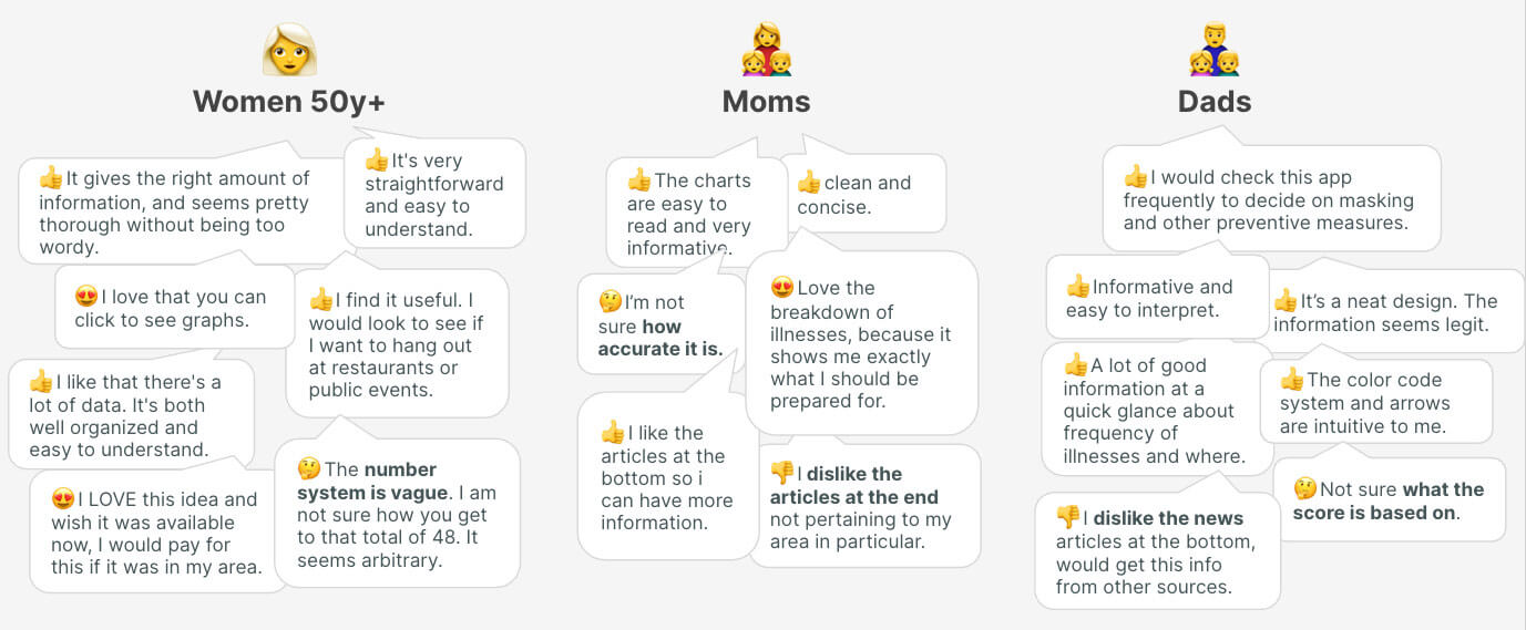
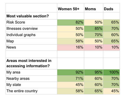
While the Risk Score number had more success with women 50y+ than young moms and dads, all sections were quite evenly valuable, apart from the news section because it did not feel relevant to most people. We removed it for the following tests.
After conducting a comprehensive analysis on the four versions for the individual illness metrics, we found that the arrow and sparkline versions received the highest scores. The arrow version was particularly popular due to its simplicity in displaying the risk direction without overwhelming the user. On the other hand, some users preferred the sparkline version as it presented more data upfront. However, a few female users had a negative reaction to the sparkline version: "they look like little sperms". As much as it was my preferred option, I couldn't overlook the strong negative reaction, especially given the fact that the majority of our users were women. So we moved forward with the arrow version.
Challenging Assumptions About Target Users
Our common belief was that anyone who is elderly and/or at higher risk is much more likely to use the tracker than young, healthy folks.
>We were wrong.
While I was watching user tests and digesting results, I realized that among our initial user groups for whom we assumed there was product-market fit, a fair amount of folks did not display great interest in it. From there, I recalibrated the following user test to target what I called 'illness data consumers'. In order to reach this specific persona, I created a simple screener question to which they had to answer 'yes' to be accepted as a tester:
'Do you check illness data (Covid, flu, etc.) on a regular basis?'
The following stats came out of a 40-person cohort: the average age was 35; 66% of the users were women; 40% were folks at risk or living with someone at risk; 40% had young children; and 25% were healthy people who simply cared about their wellness or were anxious about getting sick.
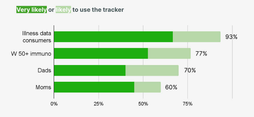
It turned out that these 'illness data consumers' were significantly more likely to use the tool than the groups I had previously tested with. 93% of them responded 'likely' or 'very likely' to use the tracker, compared to 60-77% for the other groups. This also meant that we would potentially get relevant and interesting suggestions for improvement from them.
This target audience perceived the information presentation as either better or much better than the source they were currently using, such as the CDC, NYT, local news, hospitals, etc. They enjoyed how concise and easily digestible it was. "It gives all the necessary information at a glance". The accuracy and trustworthiness of the tracker was however at the top of their mind, which confirmed the need to develop a thorough and robust methodology page accessible via direct links — 'about this data' — from the main pages.
Using the Opportunity-Solution Framework
Certain pieces of user feedback were helpful in identifying opportunities that would yield business outcomes, such as building a trustworthy reputation, generating revenue, and getting more crowd sourced data to improve the data signal. Within the opportunity-solution tree, I identified a number of solutions that were either already present in the prototype or that could be tested with users.
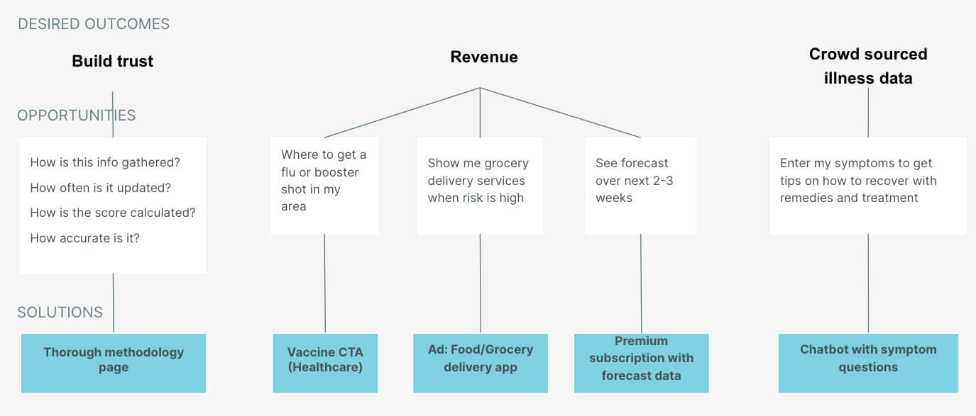
After a new round of testing, it was surprising to see that barely any of the testers showed interest in an illness forecast offered with a paid premium version. The main reason was that they did not believe in the reliability of the forecast. On the other hand, the chatbot performed well. The idea behind it was to provide tips to users to help them recover from an illness, while also getting geolocated symptoms data in order to increase the signal resolution.
Formulating the Value Proposition
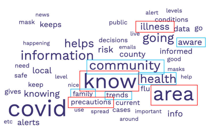
The landing page's value proposition needed to be as clear and descriptive as possible, describing the function and the benefit. To do so, I generated a word cloud from over 100 user responses on the perceived usefulness of the tracker. The intention was to create a value proposition using their own verbiage. Terms such as 'know', 'illness', 'area', 'community', 'aware', and 'health' emerged. This translated into a simple and straightforward main header: "Track illness in your area. Know when to be cautious". To provide additional context and detail, a supporting paragraph was included beneath the header.
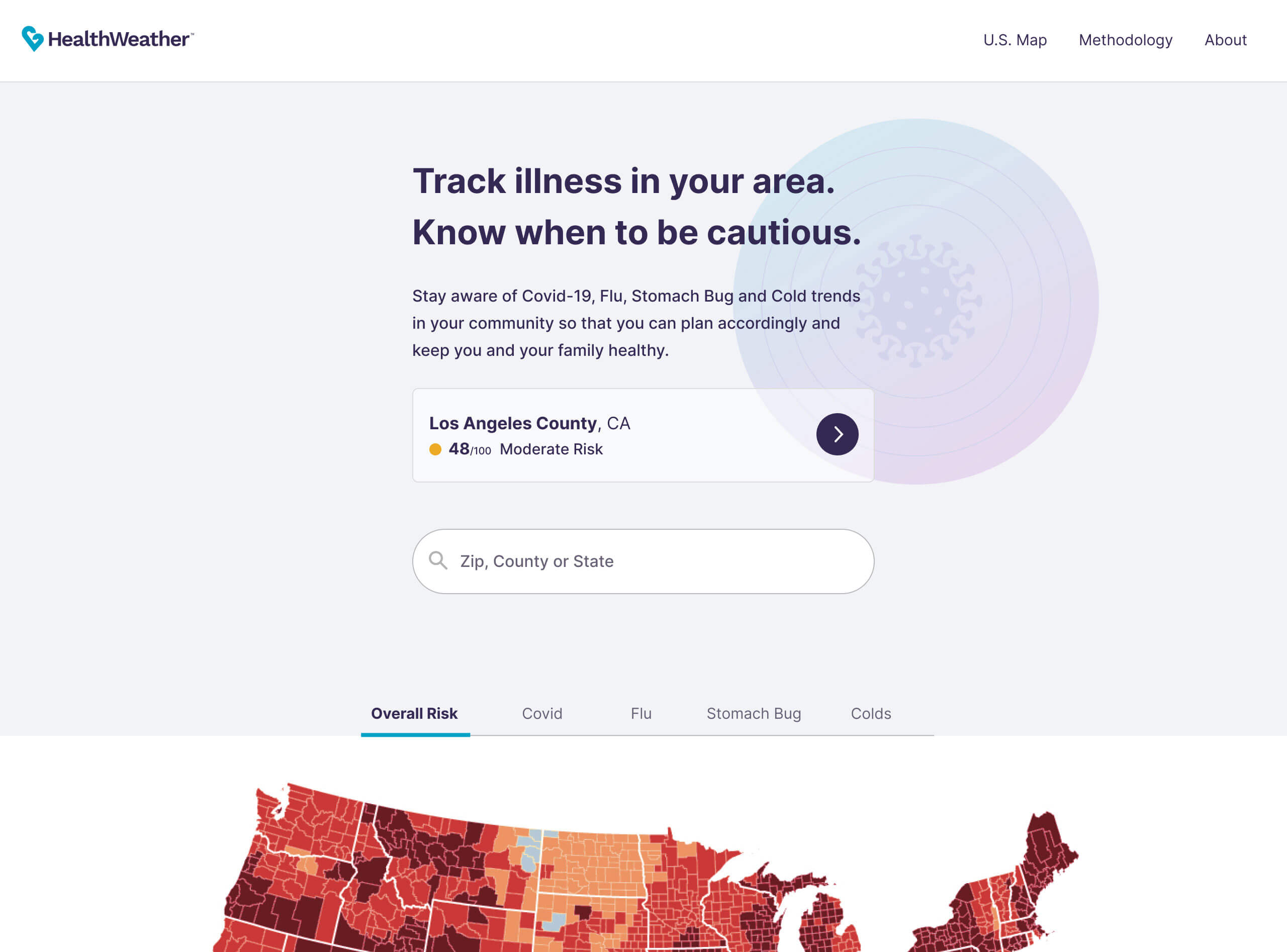
The landing page comprised a main CTA button linking to the nearest county page based on the user's geoloc, a search bar, and an interactive map displaying risk across the country based on the different metric types.
Style Guides
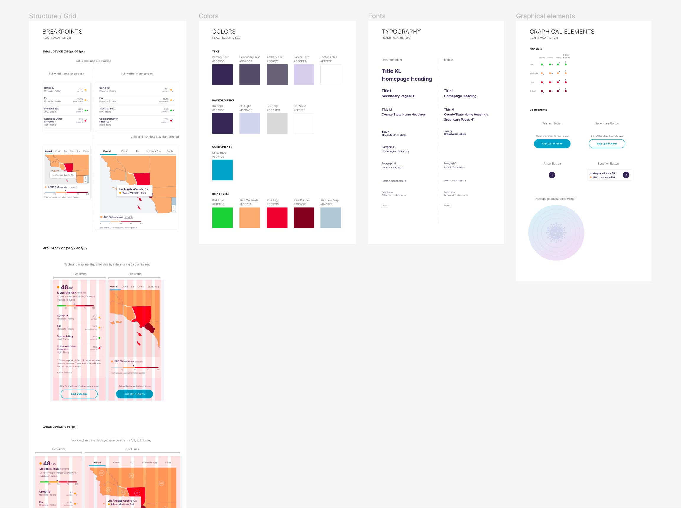
I designed a set of responsive layouts and breakpoints for an optimal display of data on each device type. While the initial version of HealthWeather made it difficult to browse risk across places, the new design elevates the user experience by adjusting the interaction design and layout to allow for comparisons at a glance. A stackable UI was utilized to minimize engineering effort. The color palette was adapted for the map to be color-blind friendly — replacing green by a bluish gray.
Impact
The design is currently being implemented and is having a phased approach.
Though in its early stages, the overhaul is well recognized and plays a transformative role inside the organization, as part of their demonstration of data capabilities in a public-facing way.
See progress on the work here.
Learnings
- First principles thinking is helpful to challenge assumptions and reach a deeper truth.
- Interest in illness data and trust in sources varies widely among users.
- It's better to get clarity on data capabilities as soon as possible.

