Flood Factor
Visualizing the flood risk of 142 million properties in the U.S.
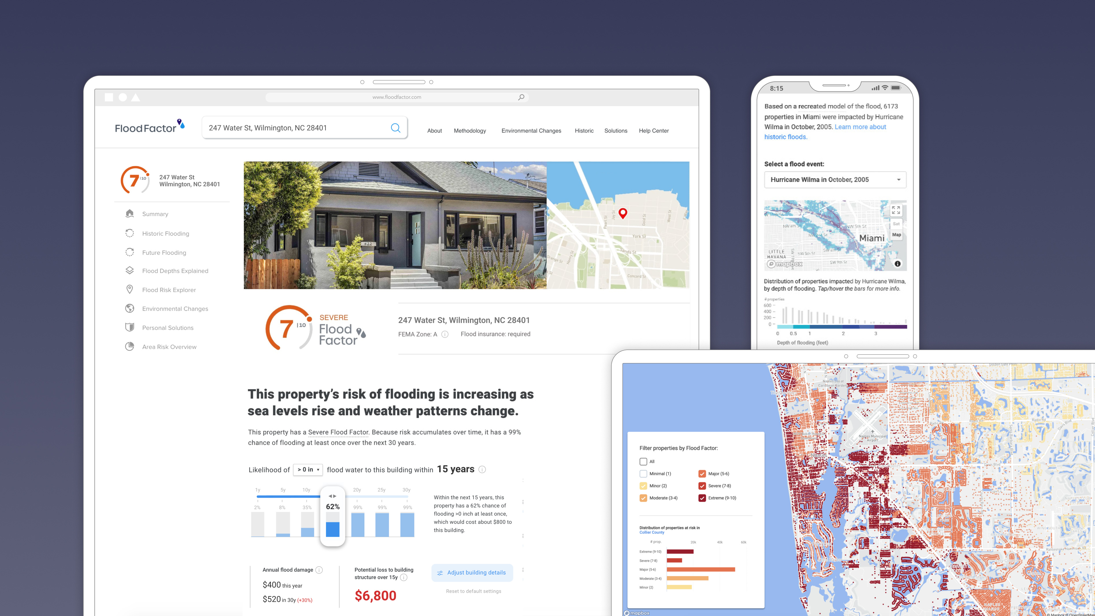
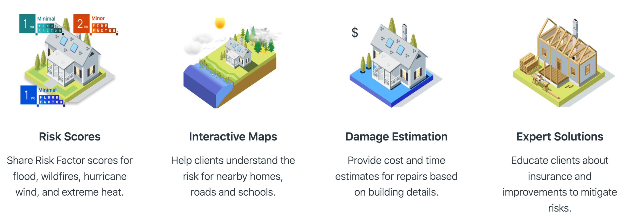
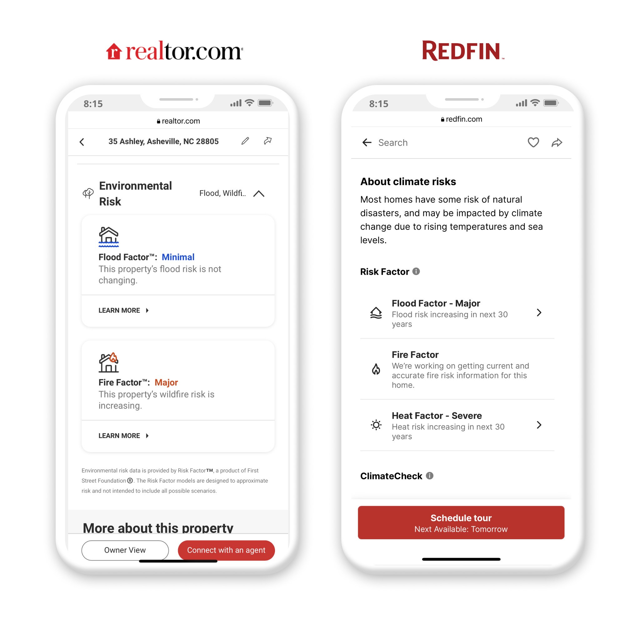
I led product design on the first online tool that democratizes flood risk information for every property in the U.S. It reached over 2 million users in the first 6 months and got integrated to Realtor and Redfin. This effort laid the groundwork for what has now become Risk Factor.
The Problem
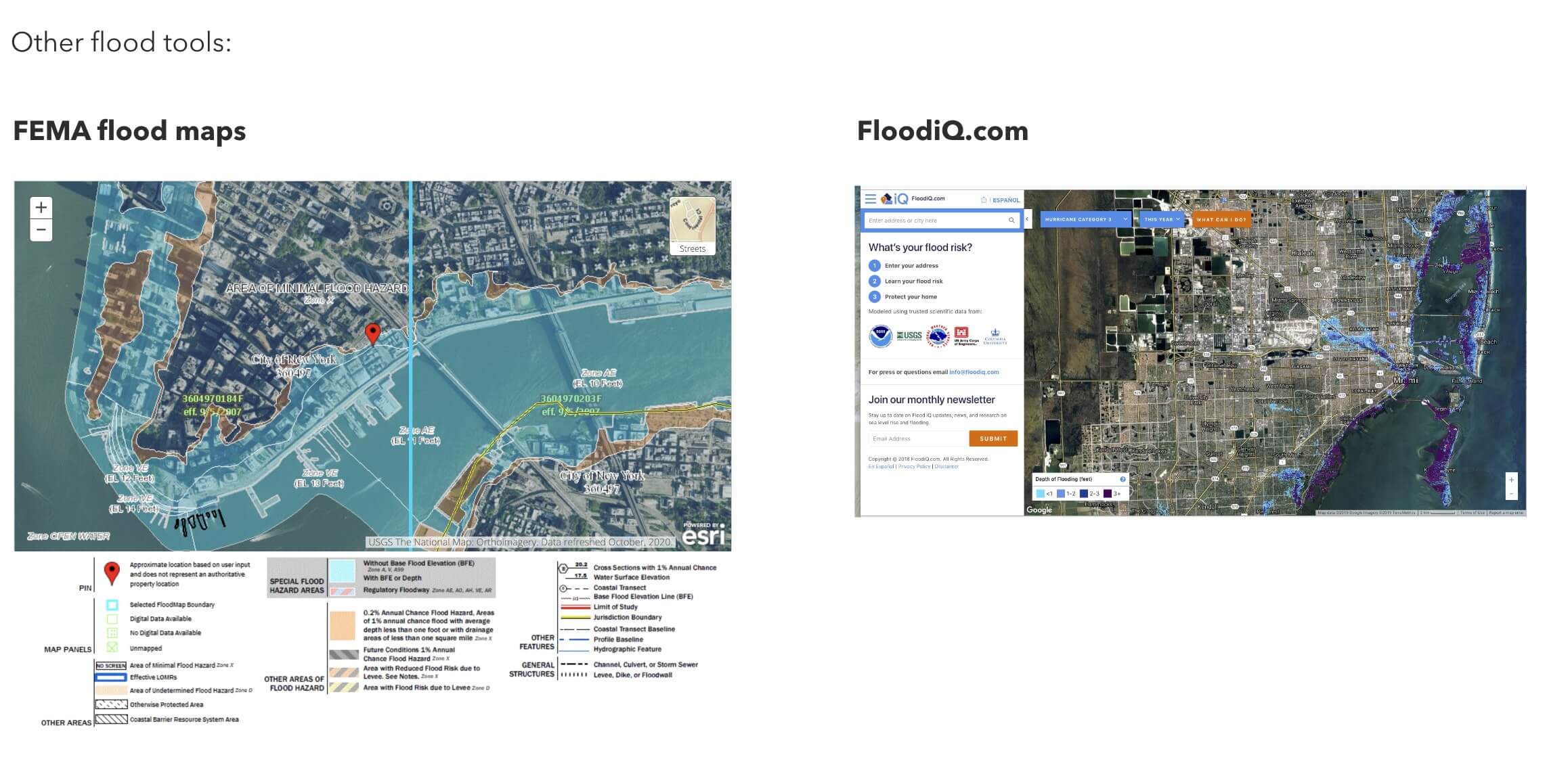
Before Flood Factor, there was no online tool that democratized flood information in an accessible and comprehensive way. FEMA's Flood Hazard Layers lacked intuitiveness and mobile optimization, while other tools were limited or outdated.
There was a need to fill this gap so that:
- Homeowners can understand their risks to better protect their home and investment.
- Homebuyers can make more informed decisions when buying.
- Banks, insurances, and real estate investors can make better climate risk-based assessements.
- The government can evaluate the climate risks and impacts associated with Agency programs, projects, assets, and stakeholders.
Main Challenges
Effectively communicating complex and multi-layered scientific data to a broad audience is challenging, especially when it involves probabilistic future risks. We worked hard to craft an engaging experience while we simultaneously developed a data model to map the risks associated with 142 million the United States. The nature of the methodology and the process of uncovering insights required us to shift from siloed work to cross-team collaboration throughout the project.

Simplifying Complex Data and Making it Personal
I collaborated in an agile environment with the product and data teams to define, design, test, build and iterate on a fully responsive web tool. As the sole product designer, I worked closely in the office with a brand and creative designer who helped out with designing screens for various sections. The PM and I conducted usability tests several times a week. We adopted an iterative approach of fast prototyping, while the data team progessively uncovered data insights for each region of the U.S.
The guiding principle given by leadership was to craft a comprehensive experience that would make complex data simple and personal, while raising awareness on the direct effects of climate change. To that point, we needed to decide what content and information architecture would be most relevant to users.
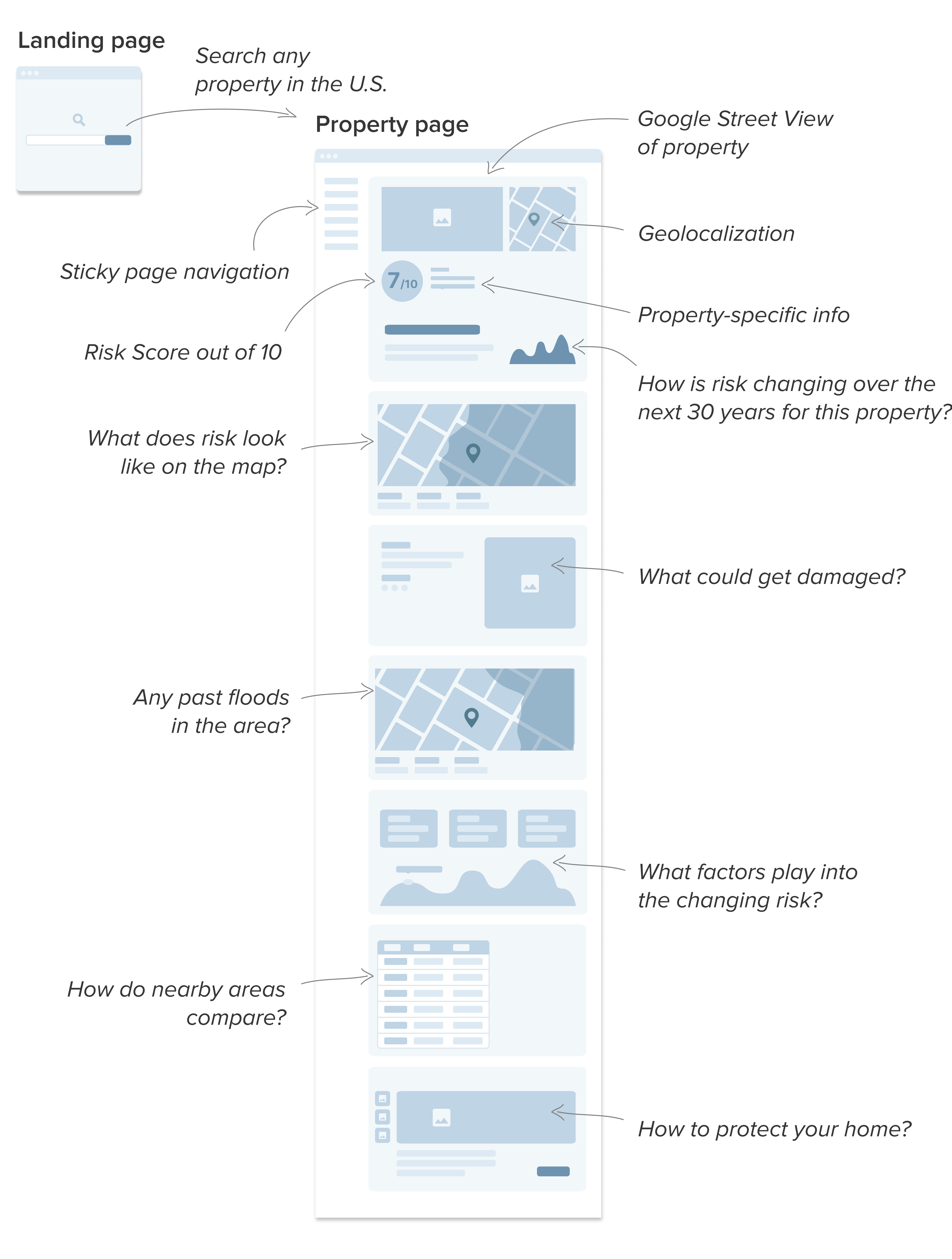
After exploring various ideas and layouts that we tested with users, we finally settled on a page structure that comprised both dynamic and static content. The flow meant to be read as a story on current, past and future risks, why risk is changing, what could be damaged, and what could be done to protect the home. Our user findings informed the overall information architecture, priorotizing the most relevant features.
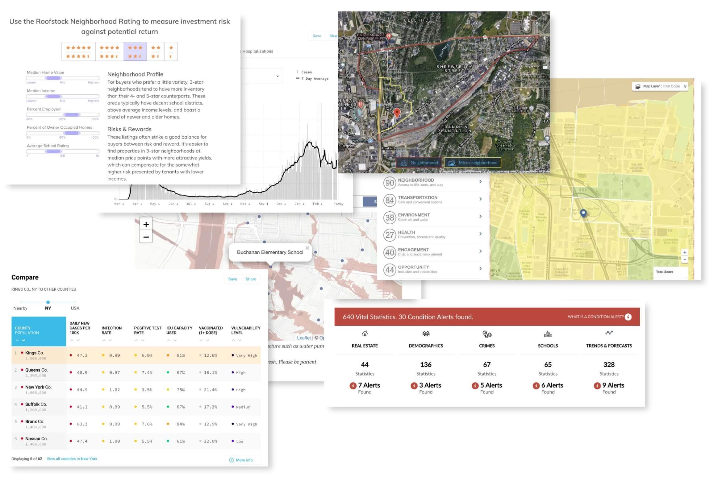
During the research phase, I gathered inspirational graphics, websites and components from various sources, regardless of the relevance to flood information. The idea was to explore ways of representing and interacting with complex information in a clear, elegant and effective way. This stage was further informed by analyzing and getting a grasp on the prelimary data produced by the data team.
Starting with simple user flows and wireframes to validate concepts with stakeholders, I then designed more polished, mobile-first mockups and highly interactive prototypes.
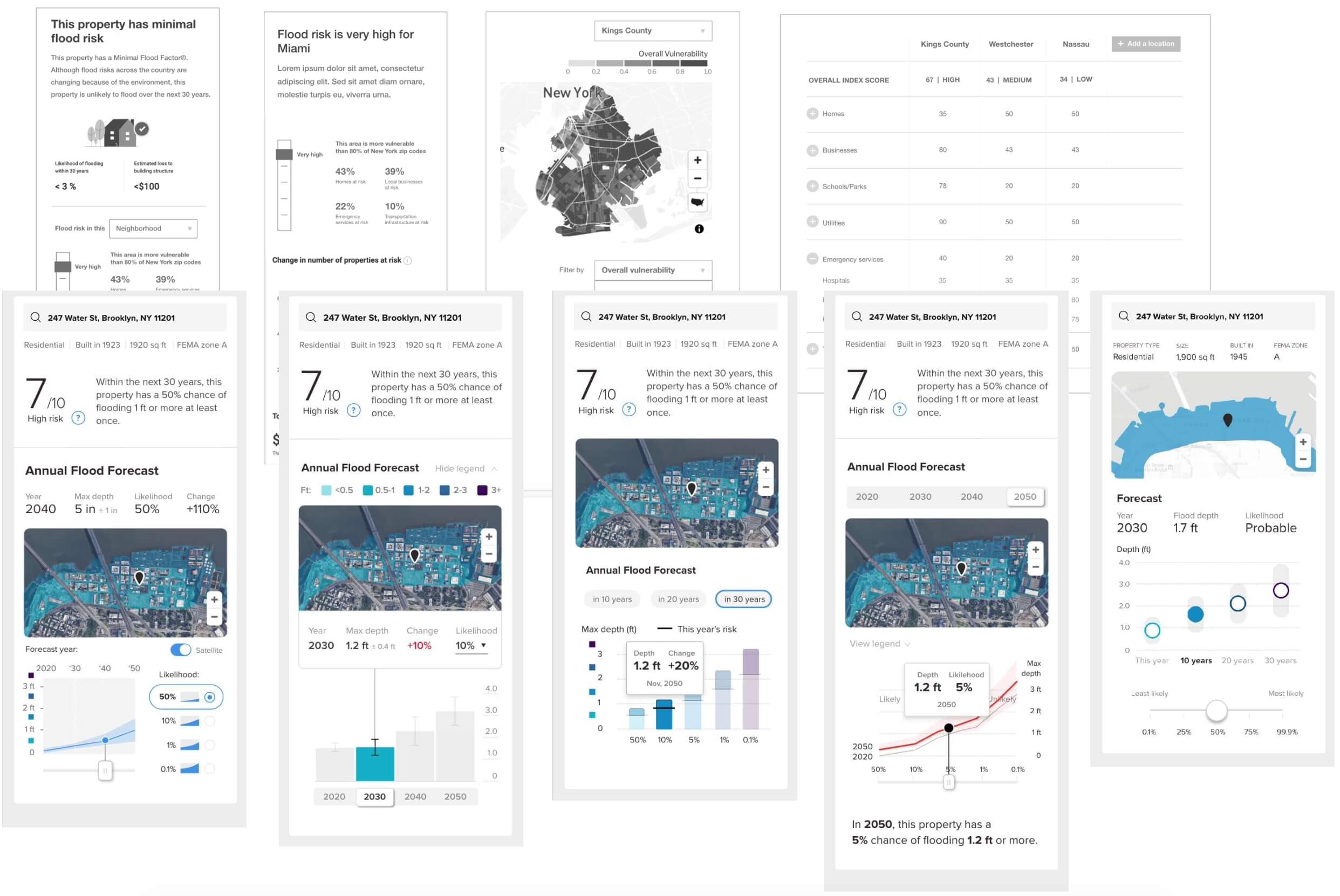
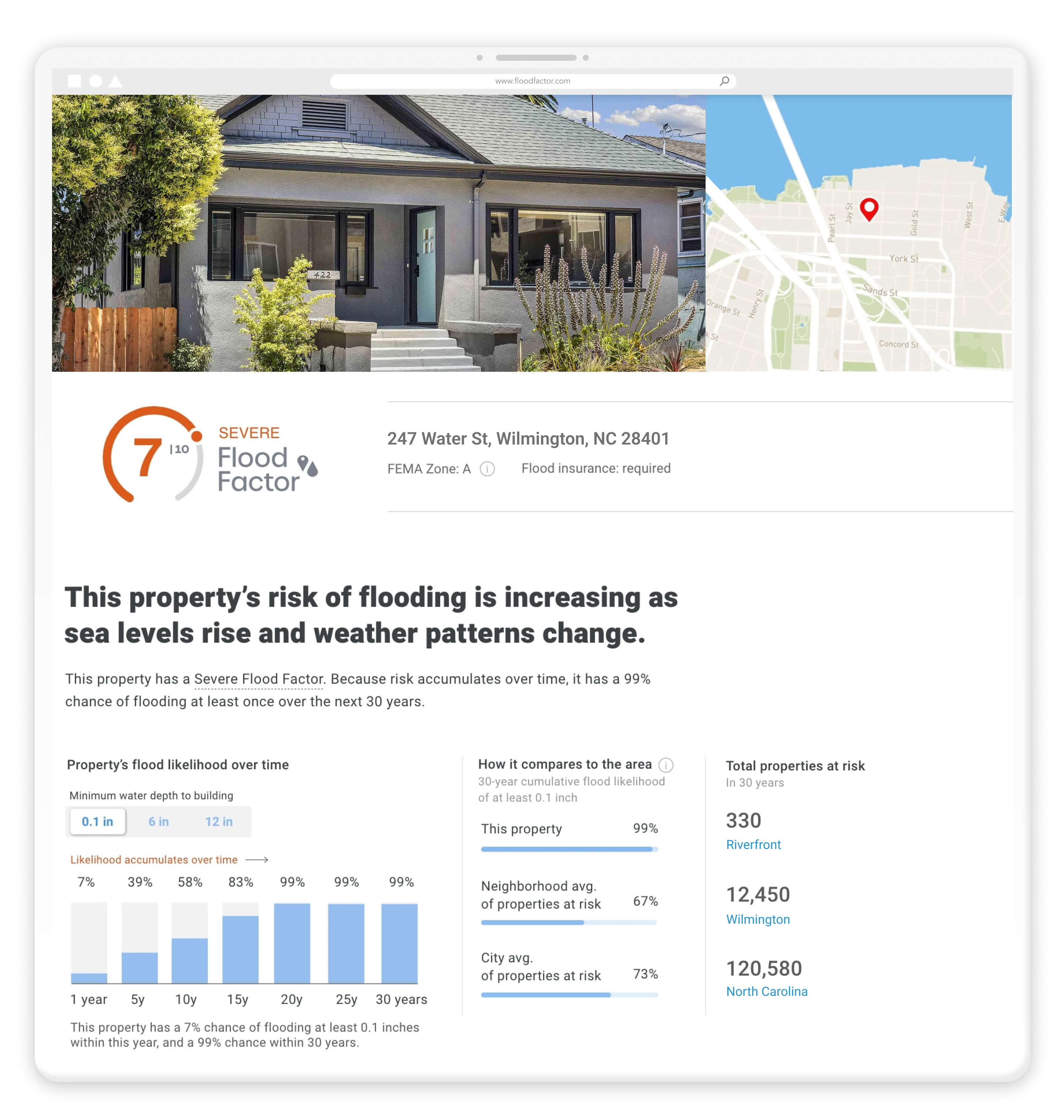
In addition to using a single score from 1 to 10 to give a general idea of the risk, we aimed to provide more detailed statistics for a complete understanding of the situation. One of the main difficulties we faced was that people find it hard to grasp and interpret probabilities. To make things more complicated, we were dealing with cumulative probabilities spanning a period of 30 years. In other words, the likelihood of flood increases over longer ownership periods.
The PM and I carefully watched user testing unmoderated videos that allowed us to identify pain points and user behaviors in order to quickly enhance the UI / data visualization concepts. This process was performed for every section of the site until the user experience became more seamless and engaging.
The initial prototype iterations revealed significant issues:
- The information density was overwhelming
- The interplay between the map and the charts was not intuitive
- The charts were too unfamiliar/esoteric
As we continued iterating, testing, and gathering more insights from the data team, we ended up simplifying the summary. It turned out that for most regions in the U.S., the actual increase in flood likelihood was much less dramatic than what we had hypothesized. And so the visuals weren't necessarily corroborating the climate message in an obvious way.
Therefore, we opted for a cumulative bar chart that was easily understood by most people. We also removed the map from the summary, which we placed lower on the page.
We noticed during testing that contextual explanations and tooltips made the presentation more understandable. Together with the PM, we iterated on the texts, using plain English. The perceived clarity of this design increased dramatically, and it eventually made it into production.
Integrating Economic Risk
As the flood model evolved, the data team also started considering the economic risks involved with flooding. We then had to find a way to show this information in a simple and clear way. I saw it as an opportunity to improve the summary section even further by making it easier to understand the risks. Money loss due to property damage is somewhat more tangible.
To do so, I tied everything together in what turned out to be a more straightforward design. Based on user testing, the slider UI was more engaging compared to the previous summary section, and the information was more easily understood.
Creating Maps
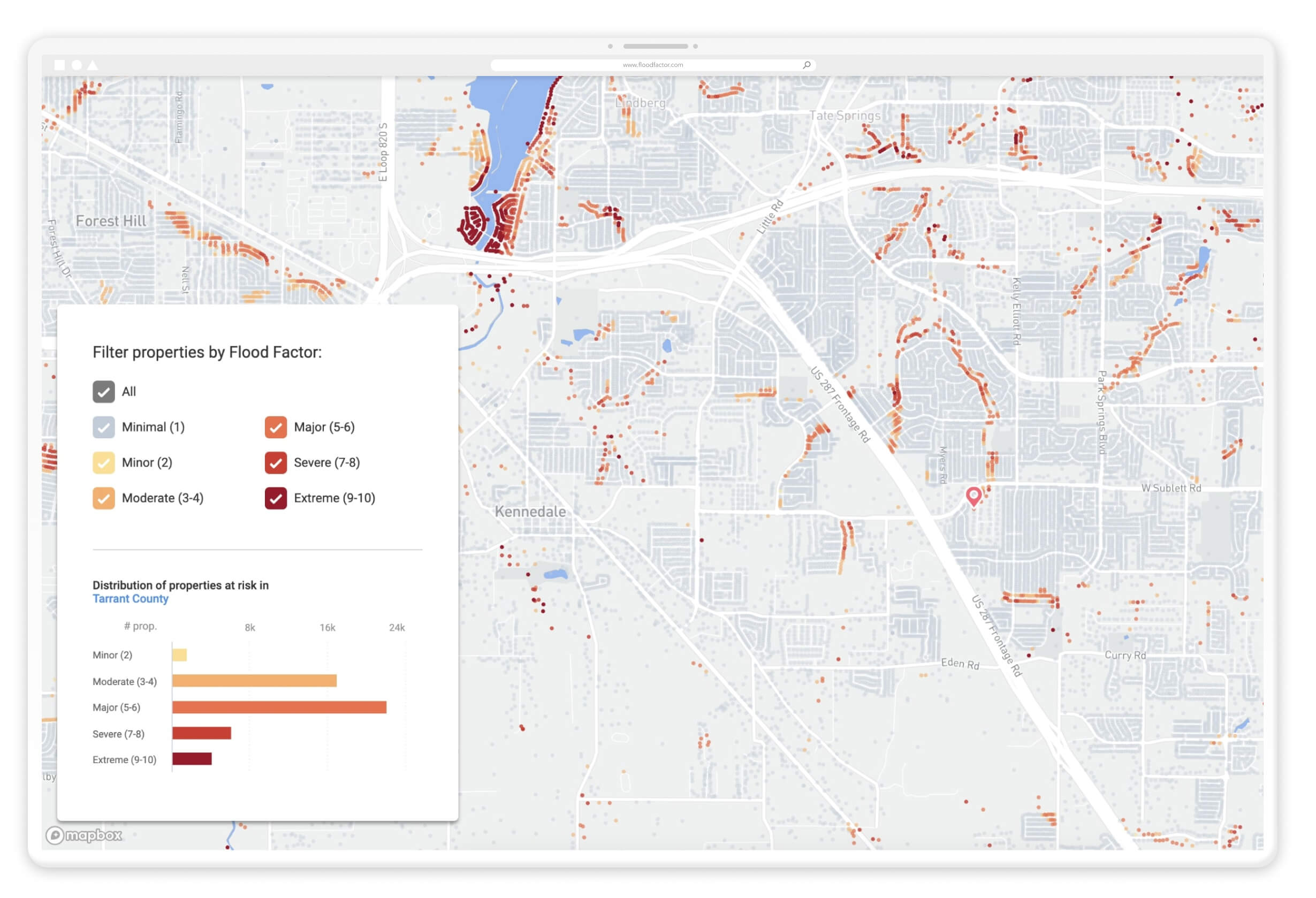
Maps are a major part of the tool, and one of the preferred features according to users. By batching scores together as users zoom in and out, the interactive maps enable them to understand their Flood Risk relative to other properties in a simple and visually compelling way. We created two types of maps:
-
A dot map to plot each property and their associated risk score.
-
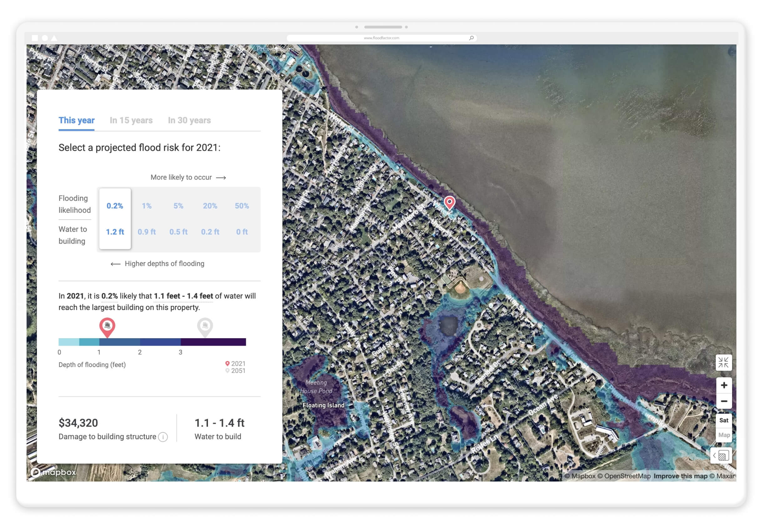
A raster data map to plot the 5 high-precision probabilistic flood layers.
To create the dot map, I used tiles generated by the data team and imported them into Mapbox Studio where I was able to define absolutely all visual parameters, for various zoom levels.
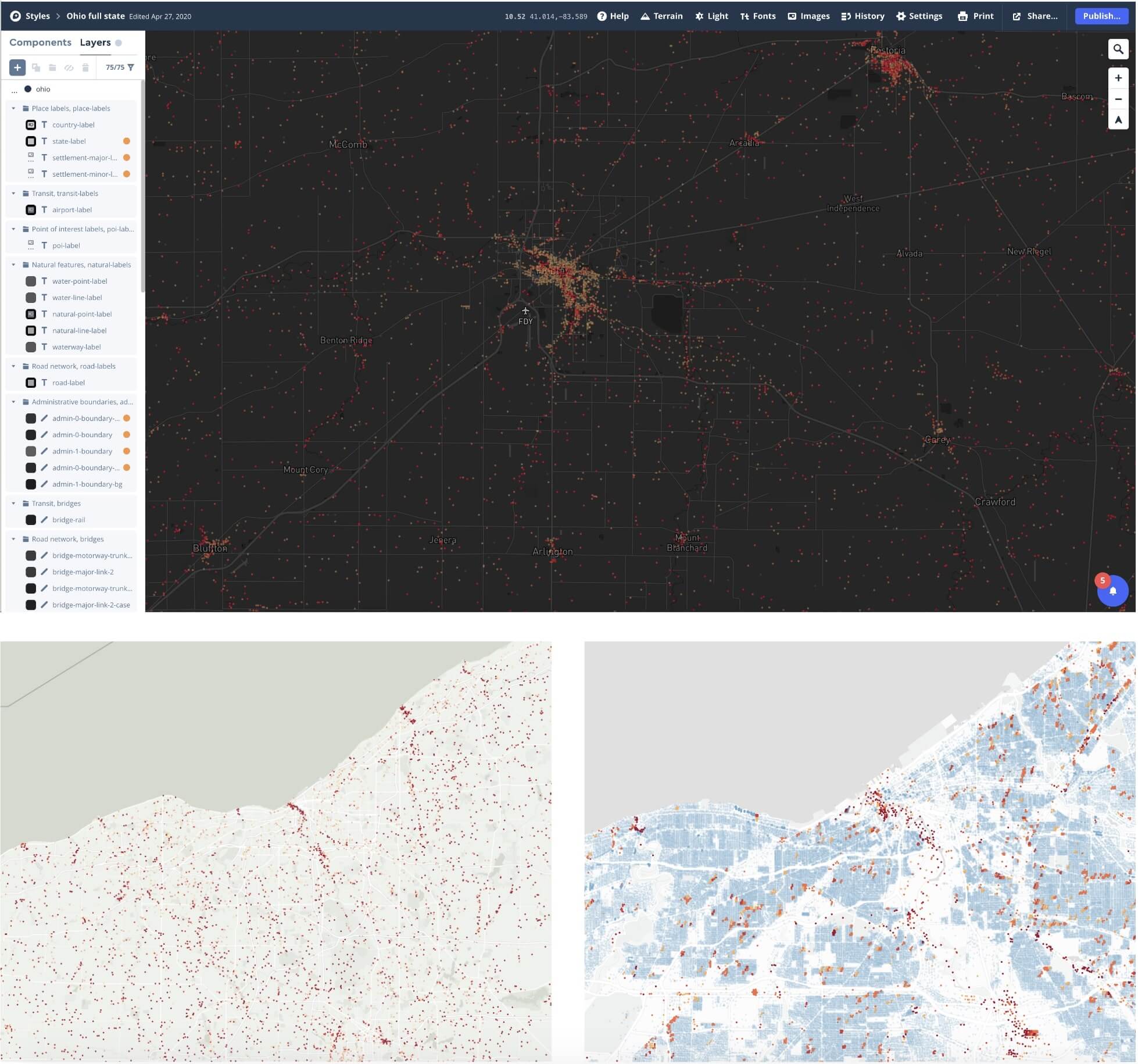
Before settling on a color scheme for the map, I explored several options to ensure that it would be accessible for users with color-blindness. Ultimately, we settled on a design that would make it easy for all users to distinguish the data from the basemap, regardless of their visual abilities. Our map displays a total of 142 million properties, and we worked hard to ensure that it rendered seamlessly at all zoom levels.
We also added a layer of controls that enable users to filter the map by risk score, zoom in and out, recenter on specific properties, and change the basemap style to satellite view.
The raster layer map shown below is different in its nature. It shows various scenarios of flooding where the potential depth of water is tied to a specific likelihood. While it is less easily understood than the dot map, it is more precise and it represents the flood model in the most visually accurate way. It also allows to see into the future with a +15y and +30y toggle, which displays the hazard layers that are predicted for those time frames. We added controls for users to explore the 5 layers and understand the relationship between probability and depth of flooding.
Building the Design System
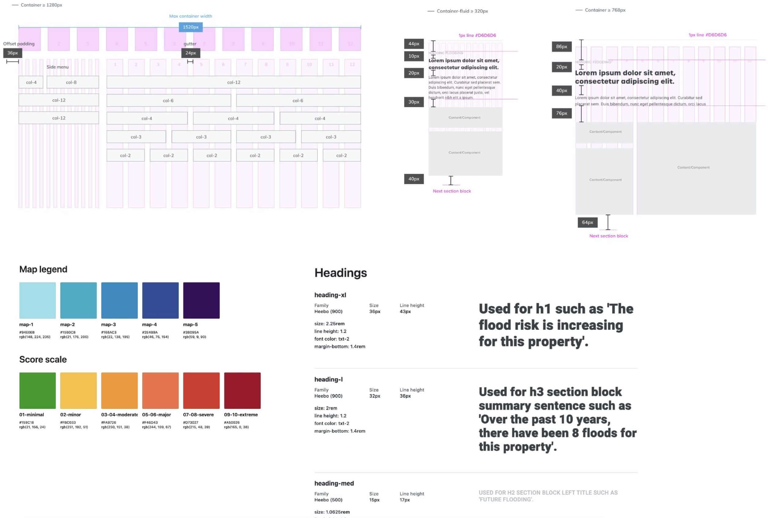
In an effort to close the gap between the designers and engineers, we built out a design system that documented all UI principles, styles and components. It served as the single source of truth and helped communication and consistency during the product development. Over its constant evolution, this system helped the entire product team scale up as we made progress in the roadmap.
Tackling User Problems
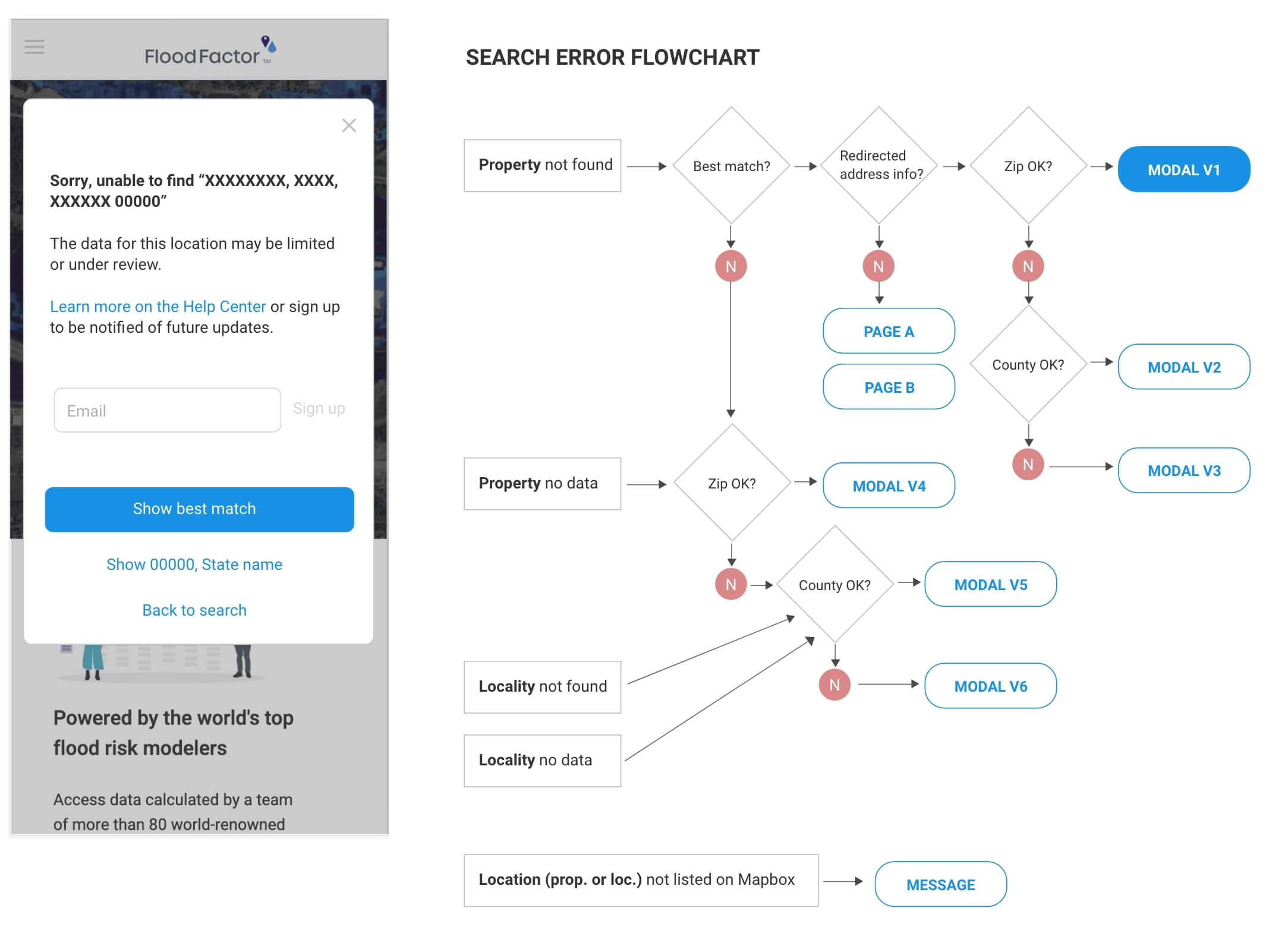
Once the tool was published and used by thousands of users, we were able to analyze common user problems by analyzing the tickets we received via the customer support. In order to reduce these pain points, it was important to quickly address them by reiterating the design-thinking process. The flowchart below is an example of a technical problem that we solved through a simple design solution.
For locations that had no data available or that could not be matched by our API, users were initially automatically redirected to the closest location’s page, which led to frustration on their end. The solution I designed was an adaptive modal that brought clarity to the experience and allowed users to get informed when a location’s data would be available. After we implemented this solution, we no longer received a single ticket regarding the issue.
We also received numerous complaints from users regarding the accuracy of our scoring system. Some people reported that the Flood Factor score was too low, indicating that their property had no risk of flooding, despite experiencing floods in the past. Others believed that their scores were too high. These complaints were particularly prevalent among homeowners looking to sell their properties on sites like Realtor and Redfin, where the Flood Factor score is prominently displayed.
Unfortunately, the scoring system did not take into account individual measures that homeowners may have taken to protect their properties, such as elevated homes or sump pumps. This means that even if a property is well-protected, it may be unfairly penalized by the system.
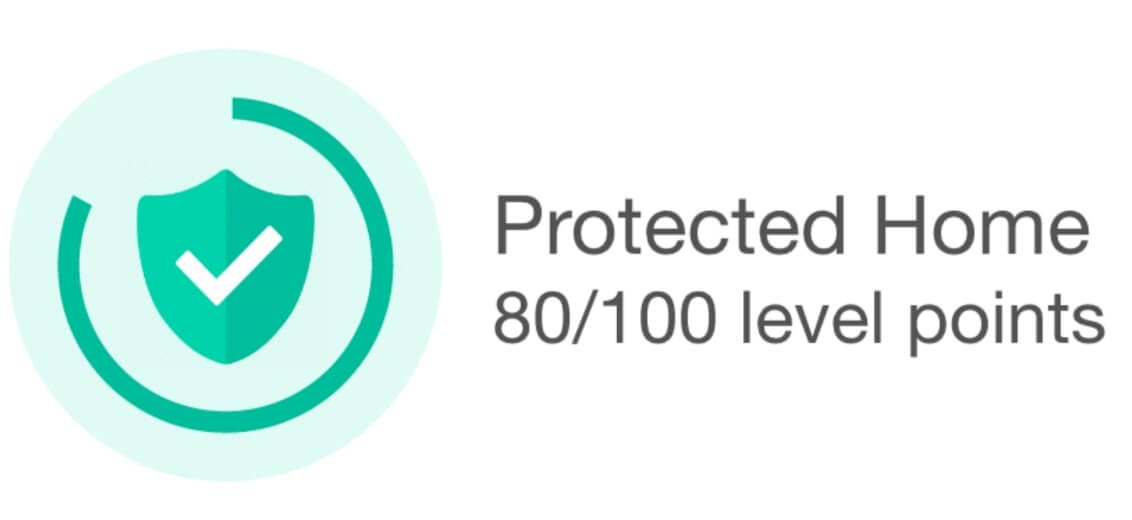
To address this issue, I suggested creating a "protection badge" that users could earn by providing proof of mitigation efforts through a user interface. The badge would appear next to the score, as a way to add nuance. The idea being also to incentivize people to protect their homes by gamifying the tool with a system of protection points. While the idea generated enthusiasm from some team members, it ultimately proved too complex to implement unfortunately.
Creating an Index for Community Risk
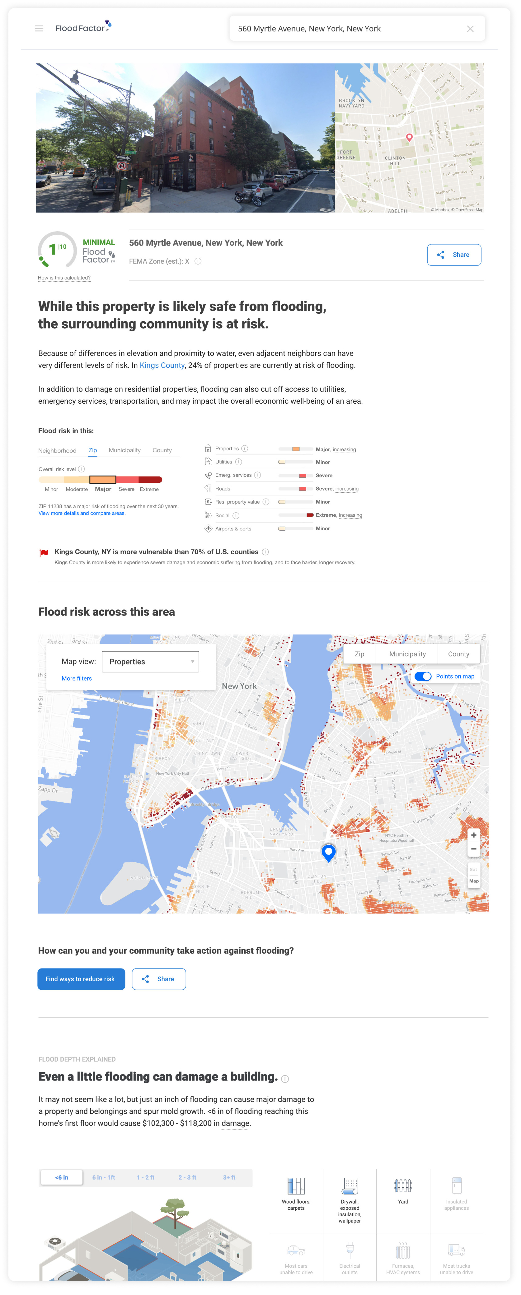
During my time working on the product post-launch, I participated in the development of a community index score. The flood model had become more sophisticated and began to incorporate additional property information. Because most properties have a minimal risk, we wanted to provide more context for users and help them understand the potential impact of floods on their livelihoods and those of their neighbors.
To ensure that the community index score was relevant to our users, we conducted a large survey to collect their sentiments on flood risk. We received a range of responses, from individualistic to more collectivist opinions. We used these responses to group the concerns under themes and design a new section of the product that would be relevant to their concerns.

To visualize these risks, I wireframed various concepts, and we ultimately settled on a multi-dimensional interactive chart along with a map. This allowed users to see how flood risk changes depending on their neighborhood, zip code, municipality, and county. By presenting the information in this way, we aimed to empower users to make more informed decisions about flood risk and encourage local politicians to take steps to protect their communities. Overall, this was a valuable contribution to the product, and it was rewarding to see how it positively impacted our users.

Animating Motion Graphics
We recognized early on that many of the concepts that the flood model incorporated needed to be explained visually to make them easier for users to understand. We decided that the best approach was to use animated videos and gifs to capture users' attention and help convey the complexity in a simple way.
While I am not an expert in motion graphics, I was excited to take on the challenge of creating a range of animations as well as a full explainer video based on a script from the content creators. These animations were used throughout the site, from the help center to contextual tooltips, and helped to explain complex concepts in a simple and engaging way.
We received positive feedback from users who found the animations helpful and informative, and we were pleased to see that they were able to increase user engagement with the product.
Impact
- 2M+ users in the first 6 months.
- Integrated on Realtor and Redfin.
- Served as a major stepping stone for what is now Risk Factor.
- Numerous references and publications from prominent media outlets.
Learnings
- Thoroughly testing all data scenarios within designs is crucial for identifying potential issues and preventing them from occurring.
- Establishing smooth cross-functional communication early on can effectively prevent a range of issues that may arise later.
- What appears straightforward to me may not be the case for most users.
- Maps and models are not reality.

